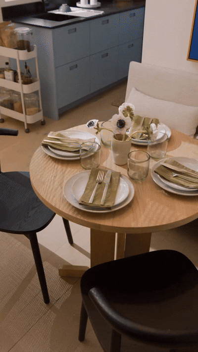
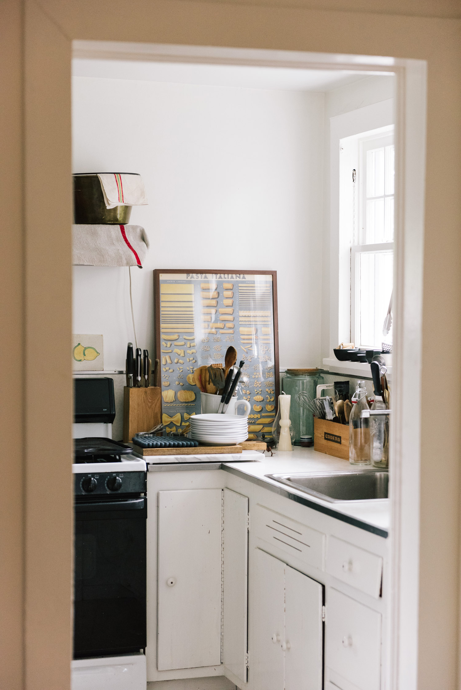
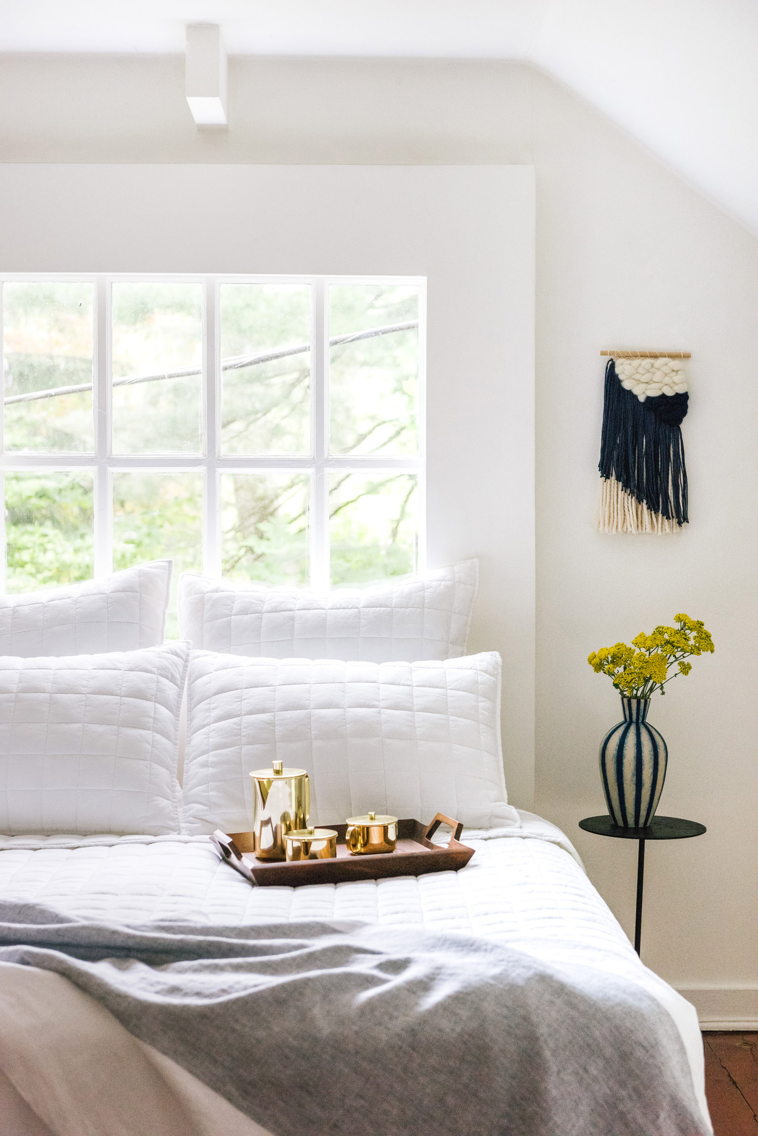
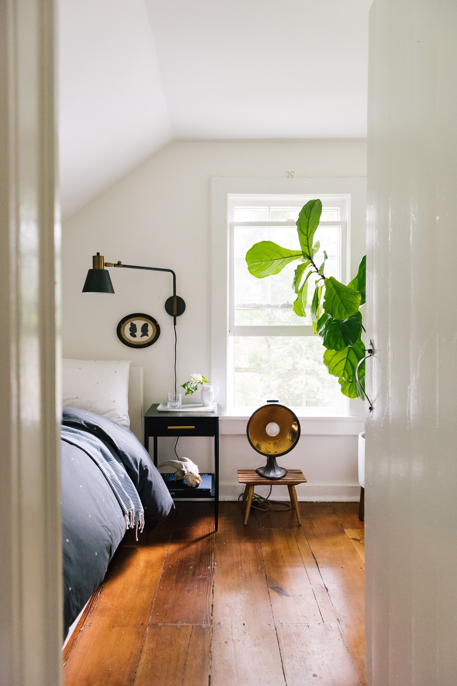
Concept, art direction, and script writing for a West Elm social series on small space living. Captured in-studio on a full-scale 1-bedroom apartment set, each installment of the series took a close look at how to optimize space for different areas of the home, from the living room to the bedroom.
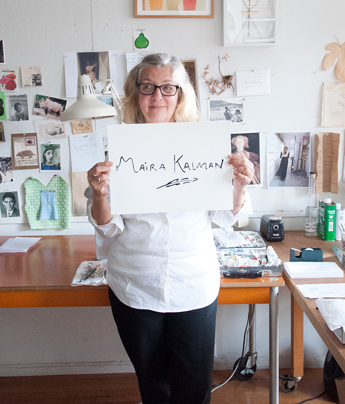
Photography and writing for a studio tour feature in Design*Sponge, profiling the artist and illustrator Maira Kalman.
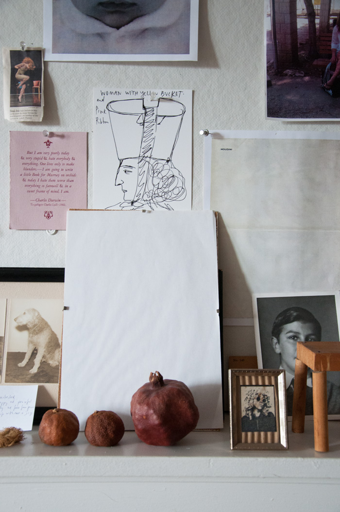
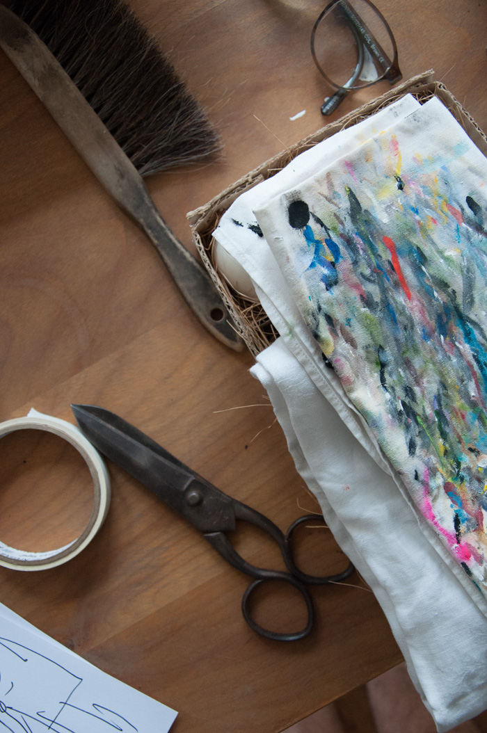
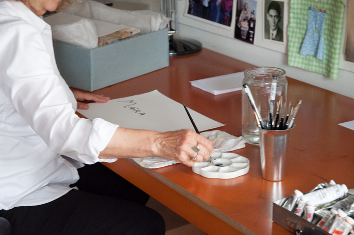
Studio Tour: Maira Kalman
In a time when all of lower Manhattan seems to have been overrun by big-box stores and Equinox gyms, the West Village studio of legendary illustrator Maira Kalman seems almost mythic—a romantic, unfussy, and deeply “New York” vestige of what the area used to be; something that one would expect to find in movies, but never in real life.
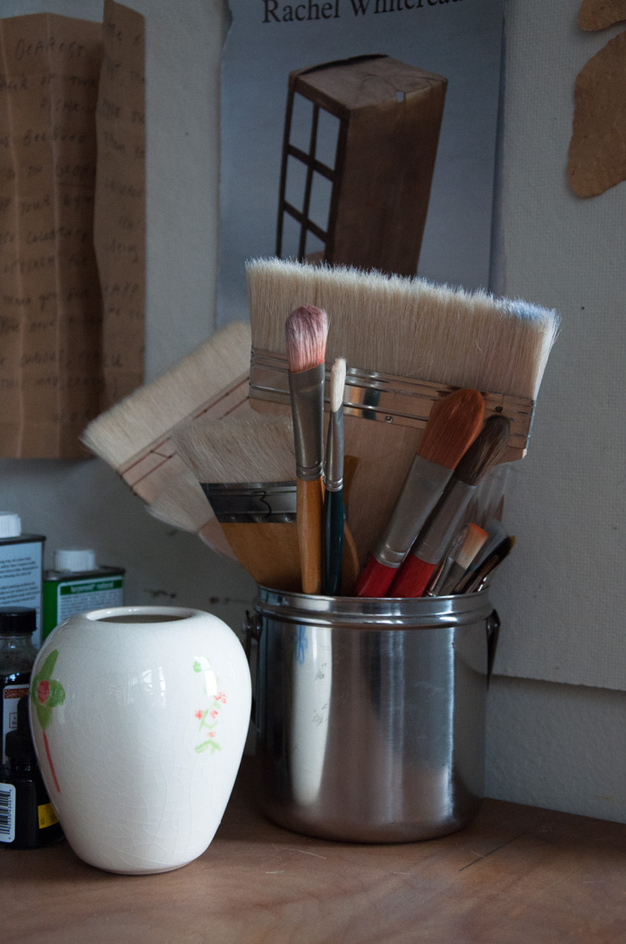
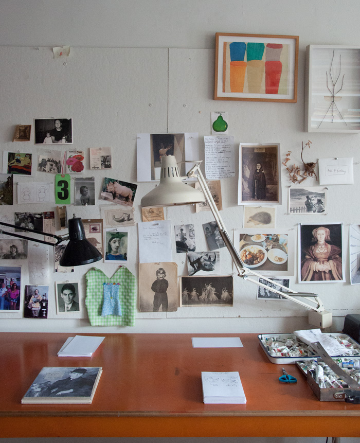
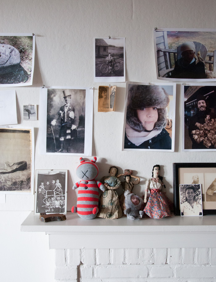
Housed just a few floors down from the apartment she has called home for over 30 years, Maira’s studio is everything you want a studio to be. Homasote-covered walls are bedecked with handwritten quotations, inspiring bits of ephemera, news clippings, and photographs of Maira’s children. Tools of the trade—from brushes and watercolor palettes to pigment-covered paint rags—cover workspaces, just as beautiful and interesting as the pictures they create. A Frank Gehry cardboard chair sits in the corner, surrounded by books. With a feeling that reads more “club house” than “office,” the whole space hums with creative energy.
Like Kalman’s own work, her studio’s charm comes from its imperfections and personalized touches. It’s a functional space, but one that bears the markings of time, labor, and love. Although each item within Maira’s studio seems to hold a special significance to her, like reminders of specific events or people, an outsider might look at it as something of a treasure trove. Despite its small size, this is a space you could get lost in.
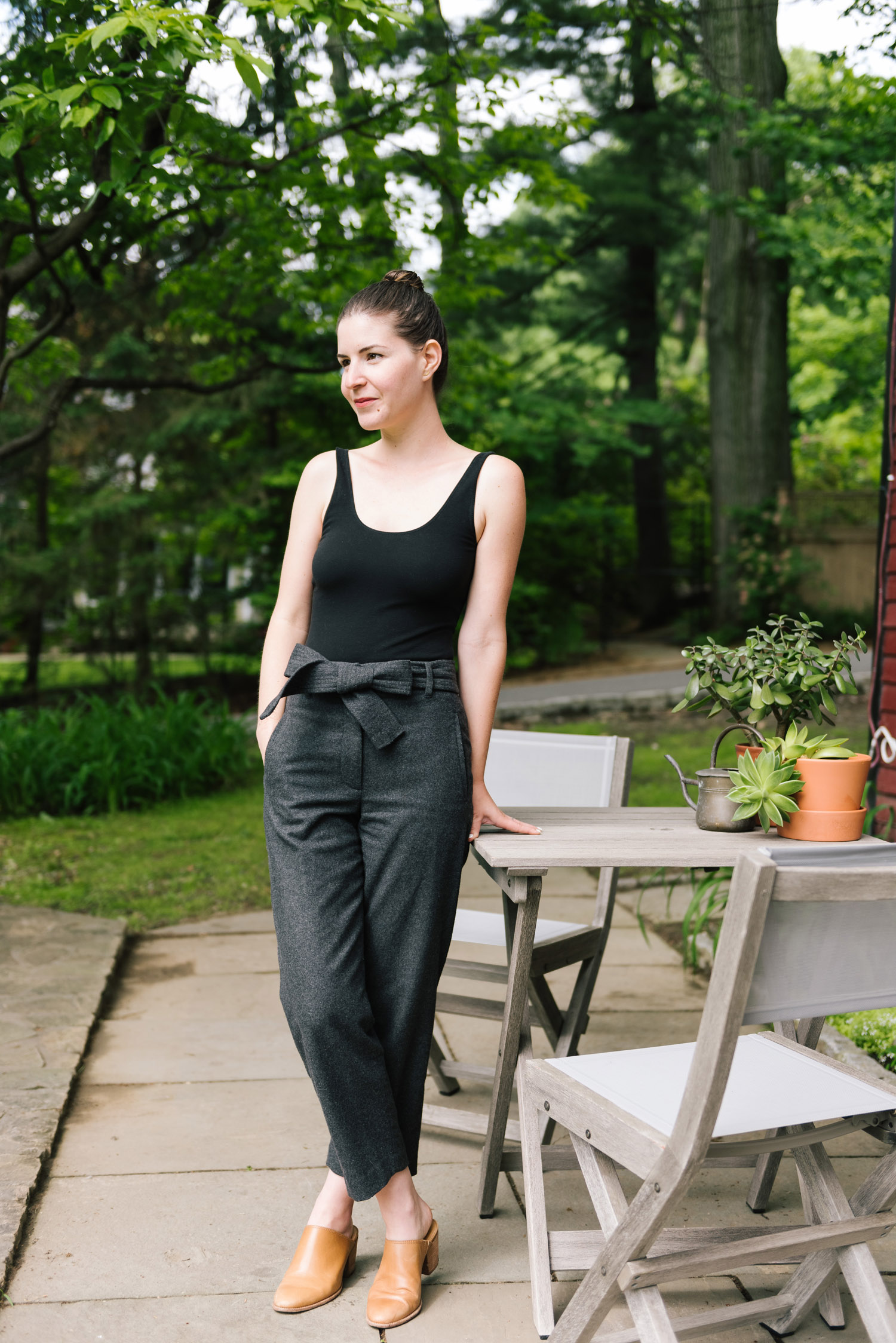
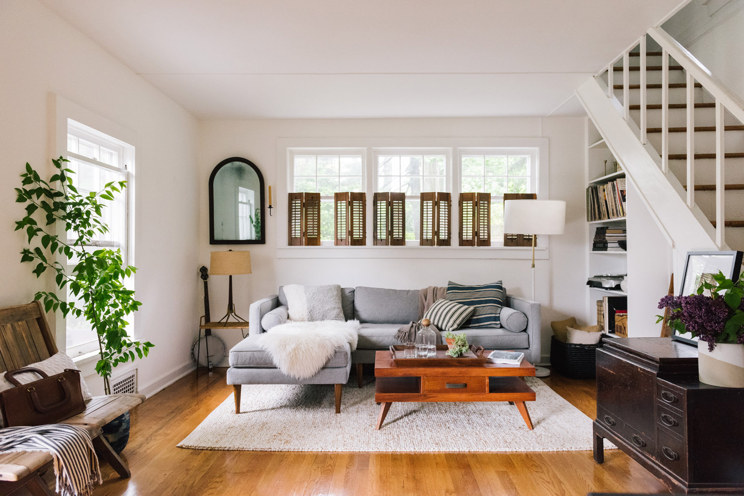
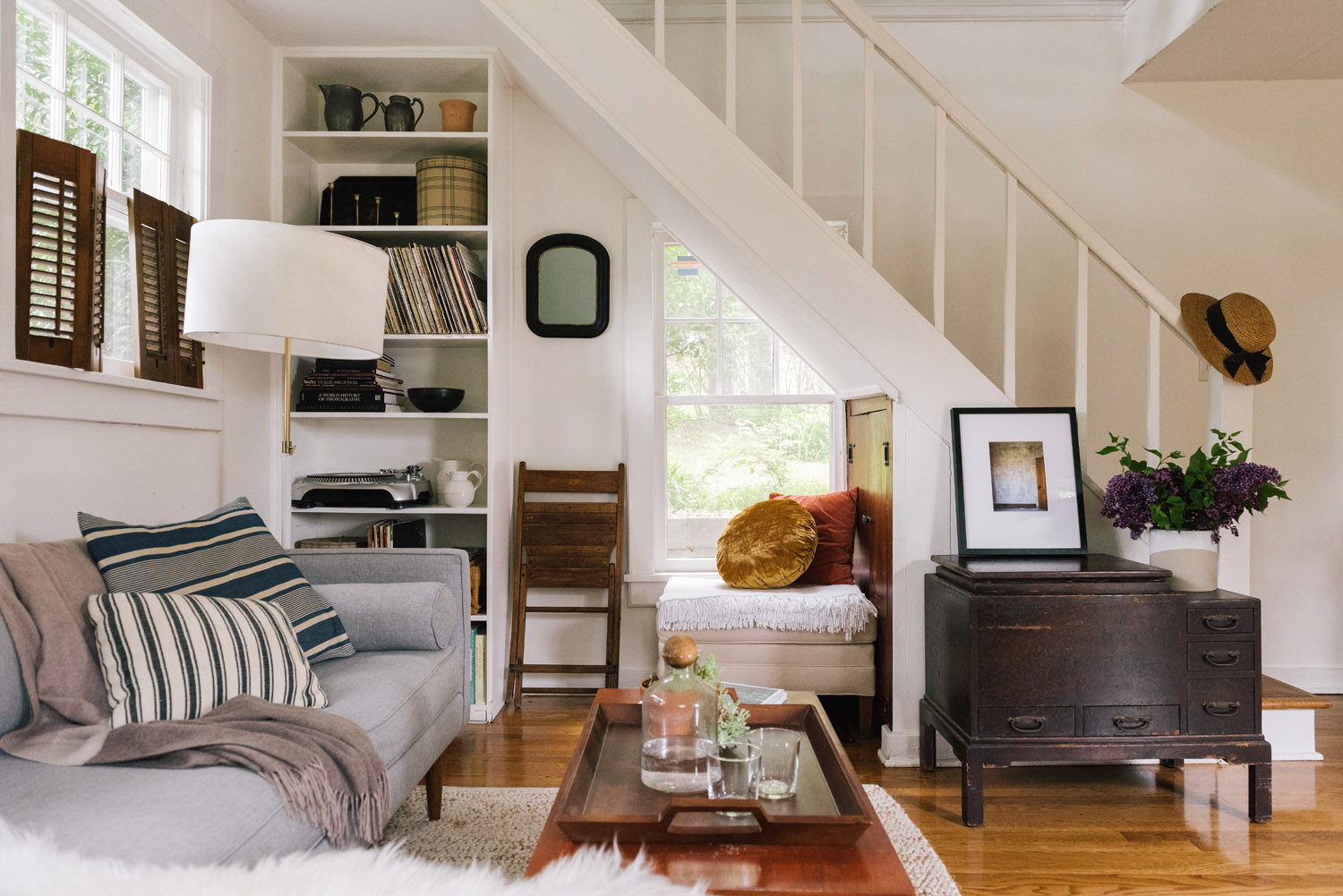
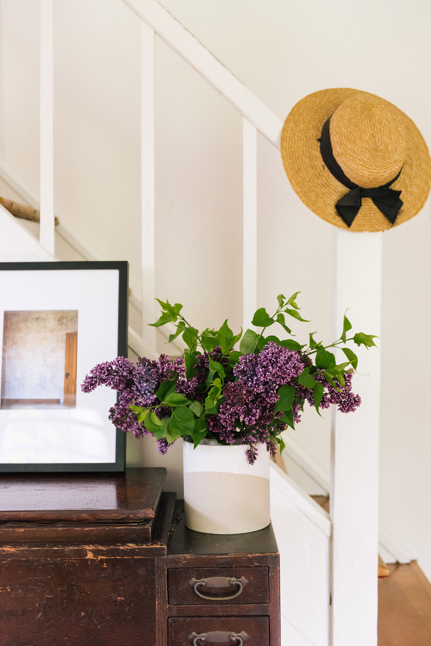
Art direction and writing for a home tour feature on West Elm’s blog, Front + Main profiling And North founder Emma Tuccillo. Framed as a traditional home tour, the feature performed double-duty as a showcase for West Elm’s new spring collection, with new items from the assortment subtly styled throughout the photography. On the originally published article, imagery was fully shoppable, allowing for a seamless experience between storytelling and shopping.
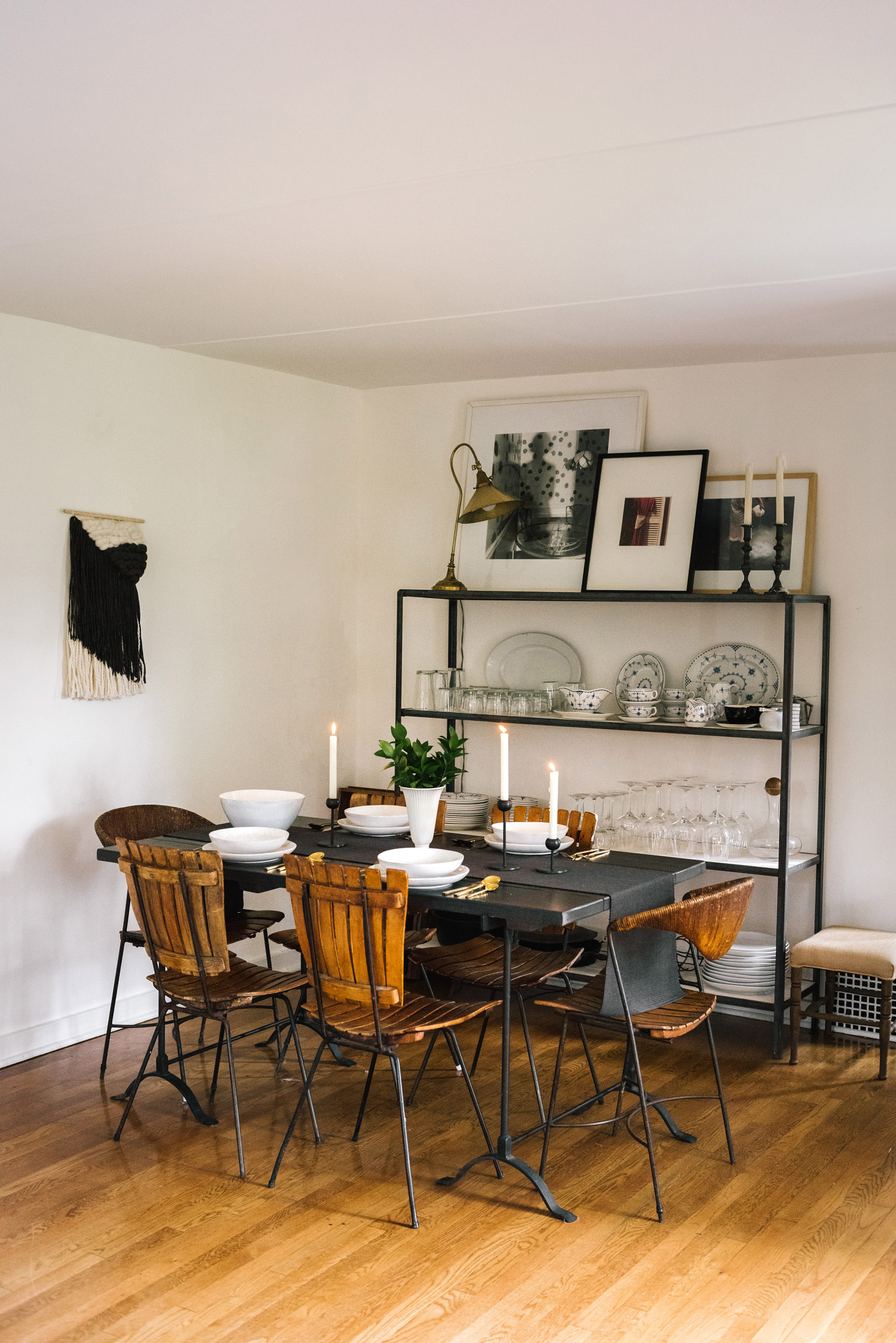
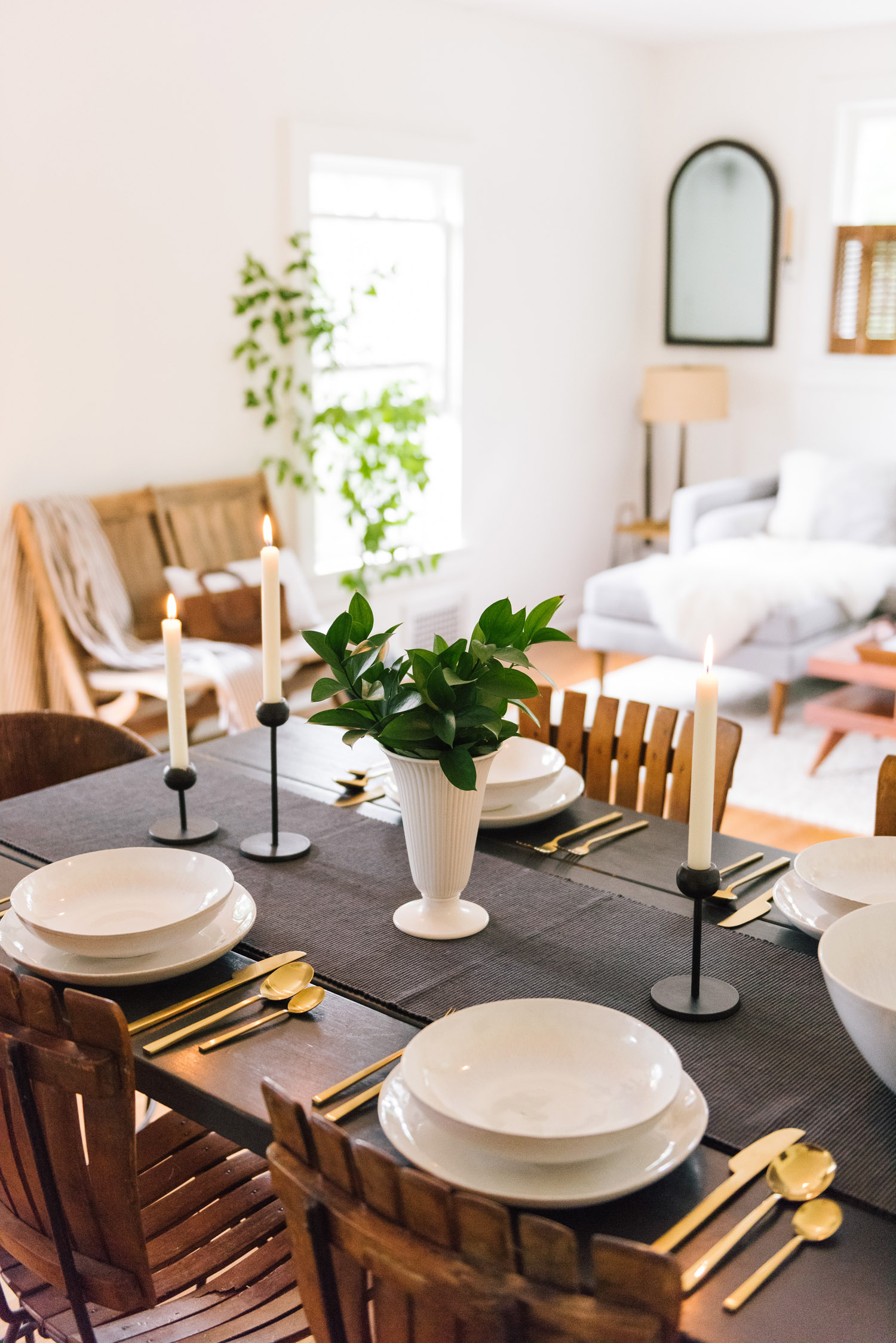
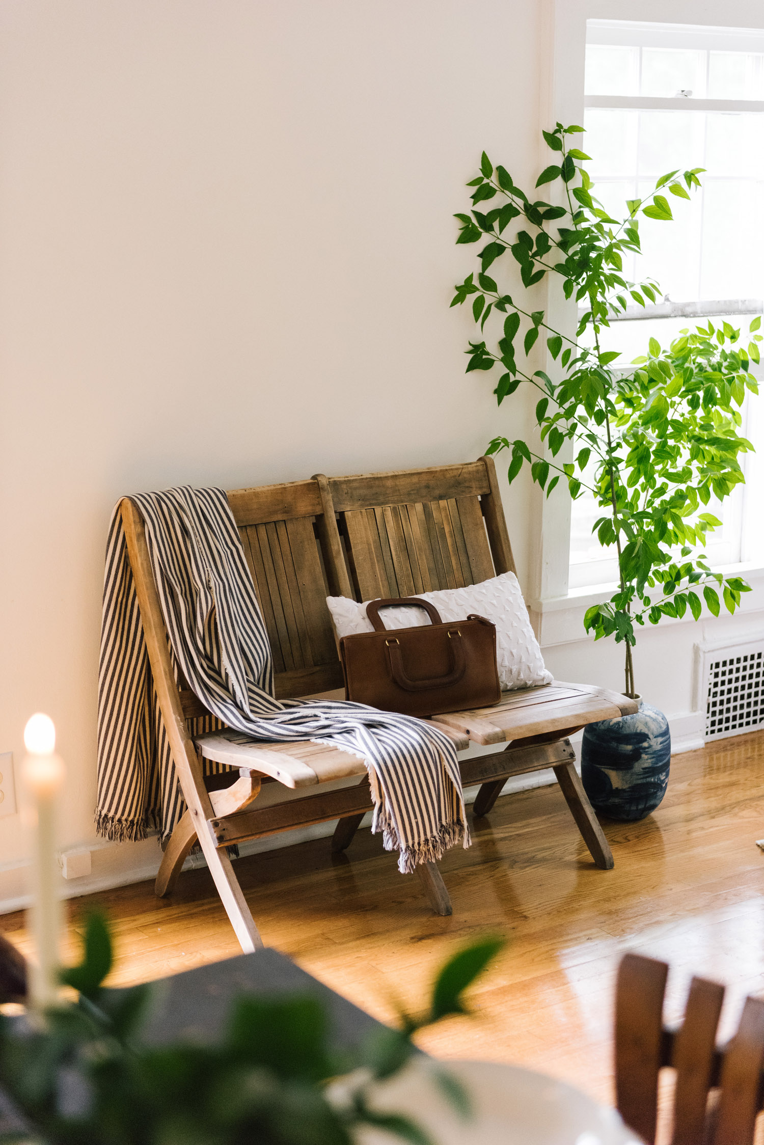
Emma Tuccillo and Nick Speranza seem to have the best of both worlds. The couple recently relocated from a small apartment in Queens to Hastings On Hudson—a charming locale with all the trappings of a small town, but located a mere 40 minutes from Midtown Manhattan. Straddling the Small-Town-Big-City life suits these two perfectly, with Nick operating as the wine buyer for Eataly Vino in Flatiron and Emma helming the creative direction of Upstate New York lifestyle guide, And North. Weekdays often find Nick walking down a hill to catch the Metro North train into the city and Emma working remotely—in the eighteenth century goat barn that the two call home.
Located on the riverfront grounds of a larger estate, the red-painted two-level barn is almost absurdly picturesque. It’s modest in size, but abundant in the sort of charms one associates with Upstate New York. One can imagine Rip Van Winkle himself living here: a dutch door and a stone wall welcome guests to the tiny house; looking through the kitchen window reveals a view reminiscent of Hudson River School paintings.
Emma and Nick have met the beauty of their new surroundings with a keen set of design eyes to match. Inspired by the timeless style of Emma’s grandmother, the couple has lovingly and judiciously appointed their space with beautiful objects, both functional and decorative. The home they have crafted is one that functions as a retreat—perfect for both quiet contemplation and entertaining. “Nick and I talk about our love for our home daily,” Emma says. “We feel constantly lucky to live here and are especially inspired by the little things like a boat going by on the river, the evening light filtering through our dutch doors, or the way our family heirlooms have combined so beautifully. At night, we take in the night air on walks around the neighborhood and pinch ourselves that we get to live somewhere this beautiful.”
Photography and writing for a home tour feature in Design*Sponge, profiling Bill Hovard, the founder of Hudson Made.
A Rural 1800s Barn Becomes a Modern Home
After spending several years living within the concrete confines of Manhattan, designer Bill Hovard began to get the itch that befalls many a longterm New Yorker—the desire to uproot to greener, quieter pastures. In 2002, Bill began his search by drawing a 90-mile radius around the city and eventually followed the country’s siren call to the quiet town of South Kortright, NY. Nestled deep within the Catskills, South Kortright features breathtaking mountain views, hillsides filled with grazing livestock, and the zen-like comfort that can only be found when one travels beyond the realm of cellphone reception. Although Bill had originally envisioned settling in a Federal-style farmhouse, his path led him to a derelict, but charming, 19th century barn. Despite its disrepair, the structure was solid and featured hand-hewn, old-growth post and beam construction, a bluestone foundation, and dazzling natural surroundings. “It was love at first sight,” Bill says.
Once he settled on the location for his country retreat, it was time to get to work. Over the course of eight years, Bill renovated the barn into a beautiful, comfortable, and fully-functional living space. “It was important to strike a balance between old new” Bill notes, “and no attempt was made to hide or mask renovations or additions. Ultimately, it was preserving the past and creating a dynamic space with 21st century amenities.” For Bill, this meant sourcing materials that were regional and appropriate to the home: locally quarried bluestone, repurposed oak fixtures salvaged from other structures, and milled cherrywood for the floors and cabinetry. Filled in with antique and Modernist furniture, the home is a balanced, timeless mixture of Bill’s tastes and regional flavor.
Today, Bill has vacated the city permanently to focus full-time on Hudson Made, a lifestyle brand that features artisanal wares from regional artists and makers. “In late August, the western field on the property is in full bloom with milkweed and offers nourishment to monarch butterfly on their migration South,” Bill says. “This is how the property was suitably named. ‘Milkweed Barn’ has subsequently gone from weekend retreat to full-time residence. It is now home.”
It’s a good thing that beach season is months away, because if there is one thing that makes this time of year tolerable, it’s huge mugs of piping-hot melted chocolate, milk, and whipped cream. We’re talking, of course, about the obligatory beverage of any wintertime night in: hot chocolate. While your hot chocolate ritual might entail a box of factory-sealed envelopes containing micro-portions of chocolate-flavored powder (it has a time and a place and we don’t judge), we’re here to tell you that an über-rich, molten hot chocolate made from scratch takes almost the same amount of time and effort to make. Get out a bar of chocolate and put on some sweatpants—let’s make hot chocolate!
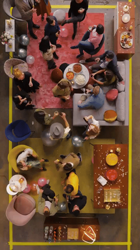
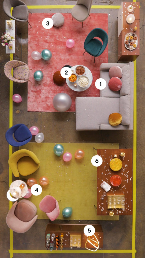
Concept, art direction, set design, video editing, and title design for a West Elm social video focused on holiday hosting. The objective of the video was to highlight how one can shift the layout of one’s living room to make it more hospitable to large holiday gatherings. The content was specifically targeted to those who might have a smaller living space or open floor plan.
There are certain things that are no-brainers when it comes to throwing a party. Food, drinks, music—check, check, check. But there are some other details that can make all the difference between a snooze-fest and an all-nighter (in a good way).
Have you ever noticed how guests always corral in the kitchen during parties, only to leave your living room a ghost town? Do you find that people hover for too long near the canapés and cocktails without circulating? The problem could be traffic flow. While your furniture arrangement might work for day-to-day use, a dining table or an inconvenient sectional chaise can cramp things up when things get crowded, forcing people into bottle-necks. Avoid the holiday traffic jam this year and follow these tips for maximizing your cocktail party floor plan.
A floating sofa might look lovely on a normal day, but it’s only in the way during a party. Scoot all of your furniture along the walls for your fête to create a clear flow for walking and enough standing room for everybody to be comfortable. Bonus points: if you re-arrange often, think about investing in a flip sectional like our Eddy model shown here. You can switch the chaise from left to right depending on your layout.
It may be tempting to artfully arrange food and drinks in a centralized location, but it’s a recipe for overcrowding! Instead, place food and beverages throughout your party space to space people out and subtly encourage mingling. Coffee + side tables are great places to put a bowl or two of snacks.
Need extra seating? Shift some of your throw pillows from your sofa to the floor for a cozy + casual place to sit down.
Move your dining chairs to the wall and form seating clusters to foster conversation. Side tables can be moved from the sofa’s edge to these areas for placing drinks and snacks.
Transform a console into a bar by putting down trays and glassware.
Swing your dining table against the wall and turn it into an oversized buffet for serving large dishes or punch!
Concept, art direction, video editing, title design, and writing for West Elm. Timed to go live with the start of the holiday season, this piece of content focused on tabletop product and was tailored towards customers planning holiday celebrations.
If you’re miserable at chopping vegetables and a roasting turkey is best left in somebody else’s care, chances are you’re the type of person who gets tasked with setting the table at holiday dinners. Although this not-quite-thrilling duty is simple (does it really matter where the salad fork goes?), it does present the culinarily challenged a rare opportunity to show off. Follow the simple tips in this video and you’ll earn extra points with your host and compliments from other dinner guests. “What a lovely table setting! Who did that?” YOU DID.
Concepted, written, and photographed as a parody feature for West Elm’s blog, Front + Main. Timed to go live during Fall Fashion Week, the story played with the idea of a trend piece that showcased how people might wear their duvet around their house.
Forget sock boots and metallics—the hottest Fall fashion trend that we can’t get enough of is duvets. With a name derived from the French term for down—an allusion to the feathery material that typically fills them—duvets are customarily seen atop lavishly appointed beds and covered in all manner of beautiful fabrics. This season, they’ve come into vogue as a stylish garment—one that can be donned for practically any occasion. Need something to wear for gala season? Duvet. Going out for a quick lunch with the ladies? Duvet. Heading to an important business meeting? Yes way, duvet! While there are myriad ways to style this new wardrobe essential, here are 10 of our favorites.
1 — The Ball Gown
The quintessential duvet look. Pair with the shoes and jewelry of your choice, or go without for a bold and minimal look.
2 — The Chic Scarf
Make a statement when you hit the streets this fall by tossing your duvet around your neck. Added bonus: it will act as a stylish airbag if you end up tripping on the sidewalk.
3 — The Lump
Got a movie night planned with your SO? Go for this elegant seated look.
4 — The Ghost
Bad hair day? No need to fret when you’ve got a duvet in your sartorial arsenal. Throw it right over your head to complete this mysterious femme fatale look.
5 — The Mermaid
Remember leg warmers? Try an au courant twist to the eighties trend by wrapping a duvet entirely around your lower body.
6 — The Friday Night
There is no better way than to celebrate the end of the week than by wearing the season’s must-have item!
7 — The Saturday Morning
Evidence that duvets are your closet’s most versatile item, they can seamlessly shift from day to night and back to day again!
8 — The Coffee Line
Add a duvet to your day and dress up even the most quotidian tasks! This comfortable look will take you from grabbing your morning coffee to powering through a day at the office.
9 — The Puddle
Favored by trend-setting avant-garde crowds, this look sees the duvet worn atop a sedentary body. Excellent for leisure activities.
10 — The Midnight Snack
Stunning when bathed in the crystalline light of a refrigerator, this ravishing look will add a touch of intrigue to your late nights.
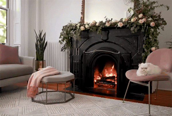
Concept, art direction, set design, and writing for the launch of a series of long-playing “fireplace” videos styled with West Elm furniture and decor. The videos were created to be played on televisions as cozy background visuals, and were accompanied by an Apple TV app that we built to stream them. This series ultimately ran multiple seasons, kicking off with the traditional holiday “yule logs,” and continuing into spring and summer with some seasonal and stylistic variations on the format, including animation.
A crackling fireplace is an obligatory fixture in any holiday fantasy, but so few of us actually have the fireplace to make such a thing happen in our own homes. Wouldn’t carving the turkey be so much better in the glow of a warm fire? Or your next cocktail party? Or opening presents on Christmas morning? If you’ve got a serious case of Fireplace FOMO, we hear you. And we came up with a solution. Enter Fireplace by west elm, our Apple TV App and YouTube Playlist that features 20+ cracking fireplaces, free to stream into your living room from your TV! It’s not a real yule log, but it’s the next best thing.
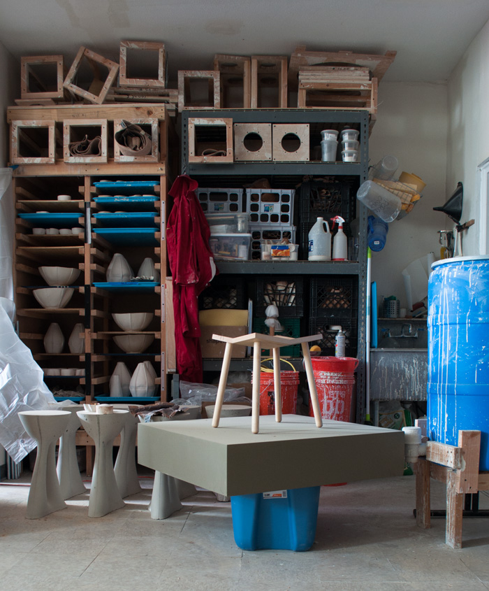
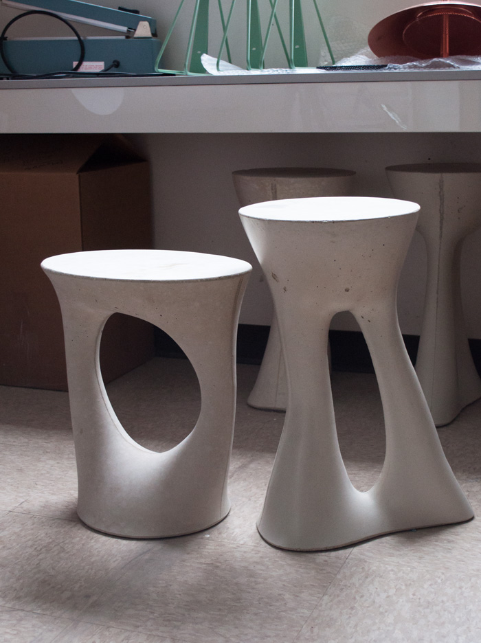
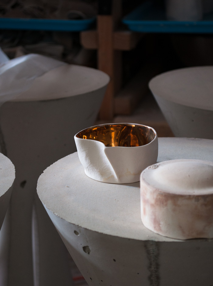
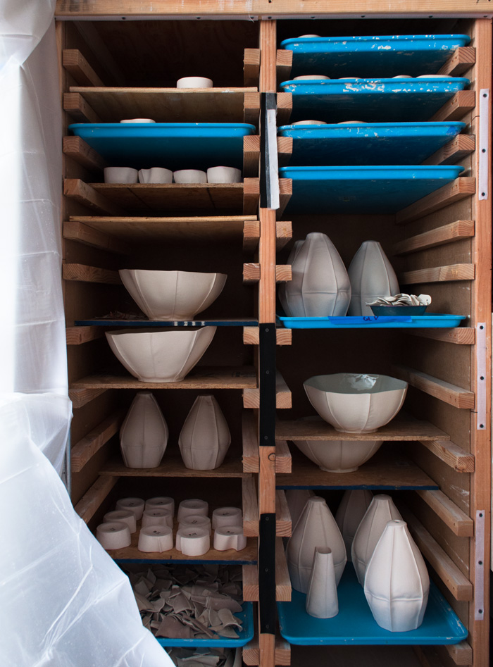
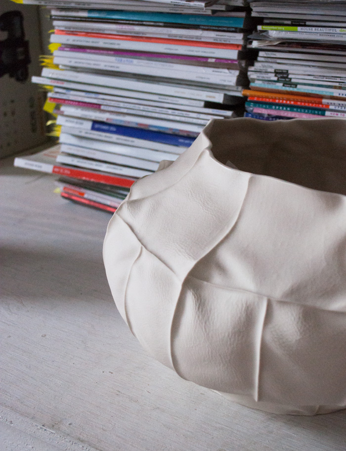
Photography and writing for a studio tour feature in Design*Sponge, profiling the Brooklyn-based design collective, Souda.
Studio Tour: Souda
It’s easy to feel slightly envious of Souda, the Brooklyn-based design collective founded by Parsons alumni Shaun Kasperbauer, Luft Tanaka, and Isaac Friedman-Heiman. When we first covered their work in early 2013, the ink on the trio’s undergraduate degrees was still drying, their collection consisted mostly of thesis work, and they were still laying the groundwork for their business. In the subsequent two years, Souda has already achieved the type of success and accolades typically reserved for old pros. From winning a New York Design Award and the title of ICFF’s Best New Designer to features in Dwell, Vogue Living, The New York Times, andWallpaper, their star only seems to be rising.
It’s not really any surprise why. Since their debut collection, Souda has been consistently pushing aesthetic and formal boundaries, expanding upon their already experimental ethos. With an oeuvre that now includes seating, shelving, lighting, and large-scale ceramics, the trio has branched out while remaining true to their style and message. Beautifully crafted using unusual methods like leather slip casting, each piece is as much a treat for the mind and the hand as it is for the eyes. A few weeks back, I had the pleasure of stopping into Souda’s Bushwick studio, a space that the friends have been renting since their Parsons days. With an impeccably appointed office and a massive workspace overflowing with creative energy, it’s hard to believe that this remains—more or less—a three-man operation.