Writing contributions for The Cooper Hewitt Museum’s “Object of The Day” (now Object of The Week) series, which launched as a way to provide the public with in-depth access to the museum’s design collection. Each day, the museum shared one object from its collection, with imagery, accession information, and a brief backstory.

A Colorful Identity
Original posting, April 18, 2013
From the New York Subway system to American Airlines, Massimo Vignelli was responsible for some of the most iconic and enduring graphic identities of the twentieth century. Born in Milan in 1931, Vignelli displayed an interest and aptitude in design at a relatively early age. At sixteen, he began working as a draftsman at Castiglioni Architects in Milan. Here, he not only became immersed in the practice of architectural design, but also in the ideas of key Modernist thinkers.
As a designer, Vignelli firmly believed that design should be clean, simple, and completely timeless. He detested trends and what he referred to as the “culture of obsolescence.” For him, good design surpassed the merely ephemeral, something he believed was a cause of waste and “visual pollution.” He favored primary colors and simple typefaces. “I don’t believe,” he has written in The Vignelli Canon, “that when you write dog the type should bark!” While Vignelli limited himself to just a few colors and typefaces, he was able to create intriguing, eye-catching designs through his clever plays with proportion, space, and balance. Like many of his modernist peers, he was obsessed with the grid and his negotiation with its stark boundaries produced elegant and beautiful results.
In 1967, Massimo Vignelli was commissioned to redesign the graphic identity of the American furniture company, Knoll. Known for its modernist furniture by designers such as Eero Saarinen, Marcel Breuer, and Harry Bertoia, Knoll’s products were perfectly suited to Vignelli’s timeless aesthetic. In the graphic program that Vignelli produced for Knoll, one can see many of his ideas at work, from his preference for clear, organized space to his use of the new (at the time) Helvetica typeface, something Vignelli undoubtedly favored because of its versatile simplicity. This poster depicts the Knoll logotype in large letters that overlap to form an almost abstract pattern. While a number of Knoll’s products are depicted as line drawings on the back of the poster, none are visible on its recto. Alone, the colorful, bold type communicates beautifully the power and elegance of the Knoll brand.
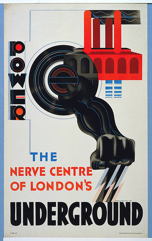
The Power Underground
Original posting: January 10, 2013
When it was introduced to London in the 19th century, the first underground railway was revolutionary. Able to provide quick, uninterrupted travel for commuters and easy access to the bustling city from the suburbs, the London Underground promised a better, more efficient future. It would take some convincing, however, to get the general public to hop onboard. People were understandably skeptical of the new technological marvel—after all, the idea of loud, smoky locomotives navigating the dark circuitry of London’s underbelly wasn’t particularly appetizing. In fact, the public was so unwilling to experience this new form of transport that the Underground Group faced bankruptcy at the beginning of the 20th century due to lack of ridership. In order to dispel any doubts about the safety and comfort of the new subway system, the general manager of the Underground, 30-year-old Frank Pick, turned to poster design to get the message across.
The first posters commissioned by Pick touted the convenience, pleasure, and affordability of traveling underground. Aesthetically, these initial posters were in line with other advertisements of the time. In addition to featuring an assortment of possible Underground passengers, these posters sought to add glamor to London Transport by illustrating the numerous scenic destinations accessible through mass transit.
As the century progressed, Pick became more adventurous in his choices for poster designers. As the public became accustomed to traveling underground, new posters were commissioned to advertise not only the Underground’s accessibility, but its modernity. This 1930 poster, Power—The Nerve Center of London’s Underground, designed by the esteemed E. McKnight Kauffer, is a one such example. Taking cues from other Modernist graphic designers, Kauffer communicates the speed and might of London’s Underground with bold, modern typefaces and dynamic illustrations.
With their stunning aesthetic qualities and avant-garde sensibilities, the Underground posters produced during the early to mid-20th century were unusual in that they blurred the line between advertising and art. In addition to graphic designers like Kauffer, Pick commissioned artists such as Man Ray, Lázsló Moholy-Nagy, and Graham Sutherland to produce posters that added beauty and prestige to the Underground brand. Pick’s preference for simple, yet aesthetically thrilling designs set a high standard for transit advertising—something that The London Underground has endeavored to continue to this day