Art direction and writing for a home tour feature on West Elm’s blog, Front + Main profiling And North founder Emma Tuccillo. Framed as a traditional home tour, the feature performed double-duty as a showcase for West Elm’s new spring collection, with new items from the assortment subtly styled throughout the photography. On the originally published article, imagery was fully shoppable, allowing for a seamless experience between storytelling and shopping.
Photography by Landon Vonderschmidt.
Styling by Marie Sullivan.
Timeless Design In An 18th Century Cottage
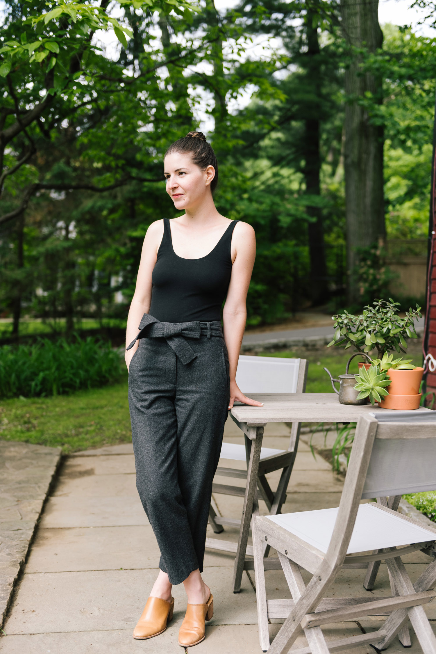
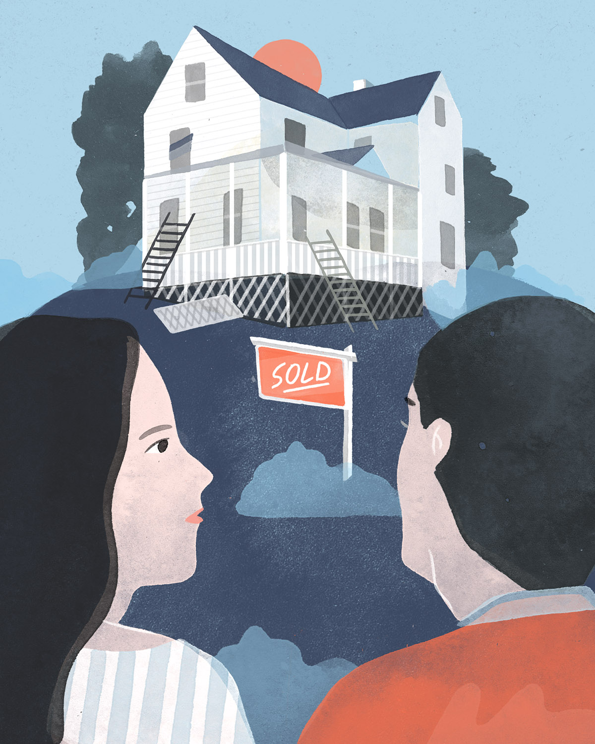
Emma Tuccillo and Nick Speranza seem to have the best of both worlds. The couple recently relocated from a small apartment in Queens to Hastings On Hudson—a charming locale with all the trappings of a small town, but located a mere 40 minutes from Midtown Manhattan. Straddling the Small-Town-Big-City life suits these two perfectly, with Nick operating as the wine buyer for Eataly Vino in Flatiron and Emma helming the creative direction of Upstate New York lifestyle guide, And North. Weekdays often find Nick walking down a hill to catch the Metro North train into the city and Emma working remotely—in the eighteenth century goat barn that the two call home.
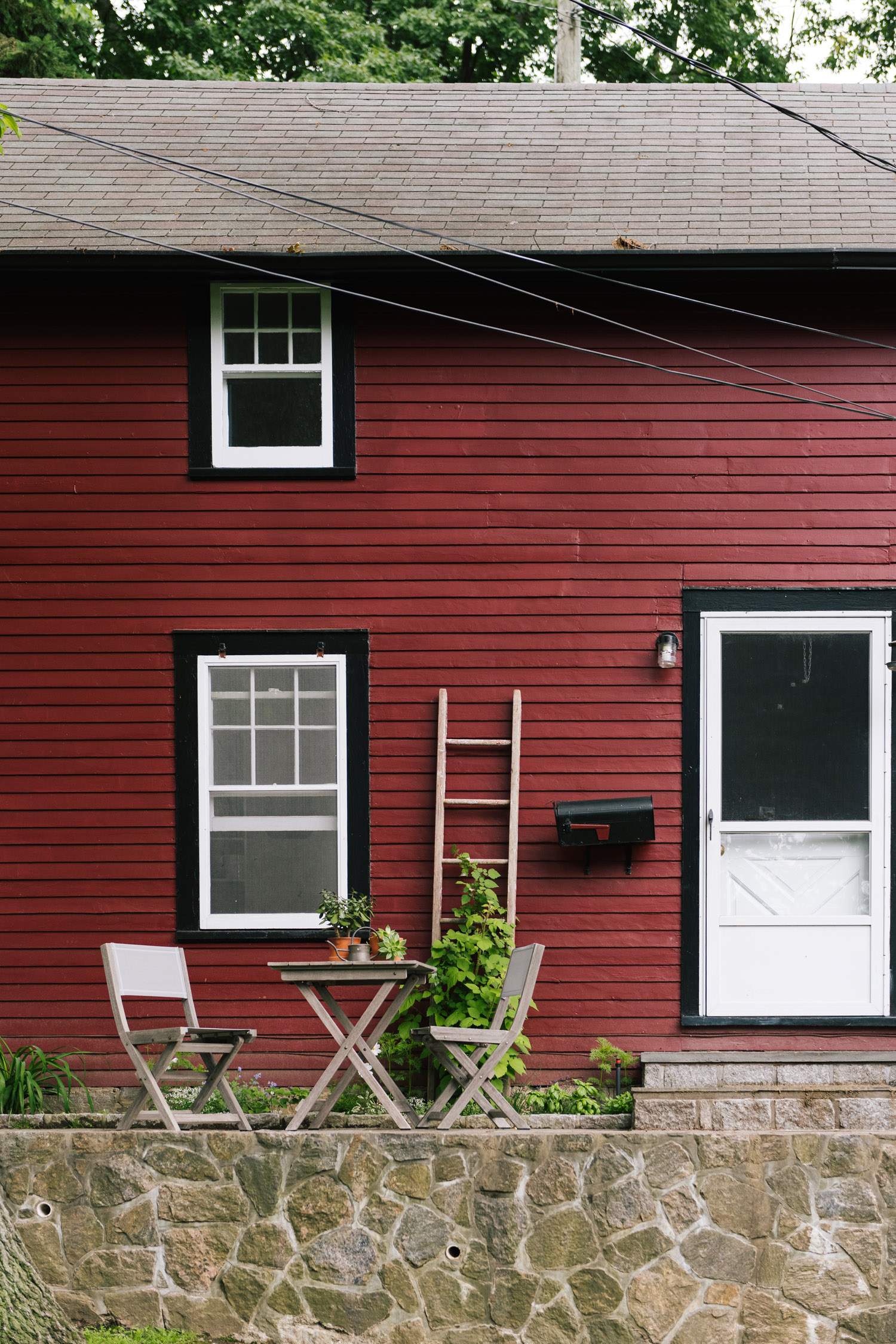
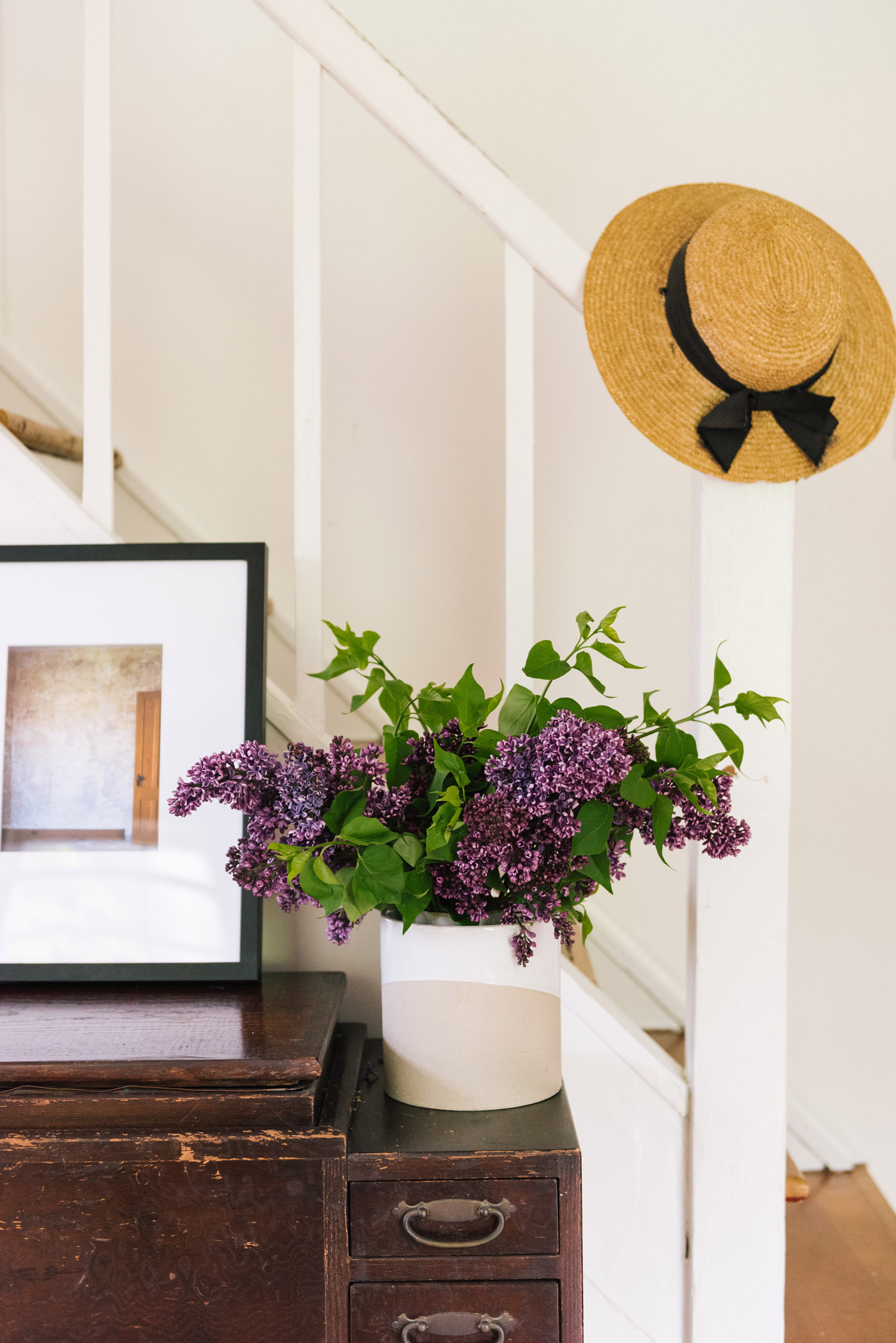
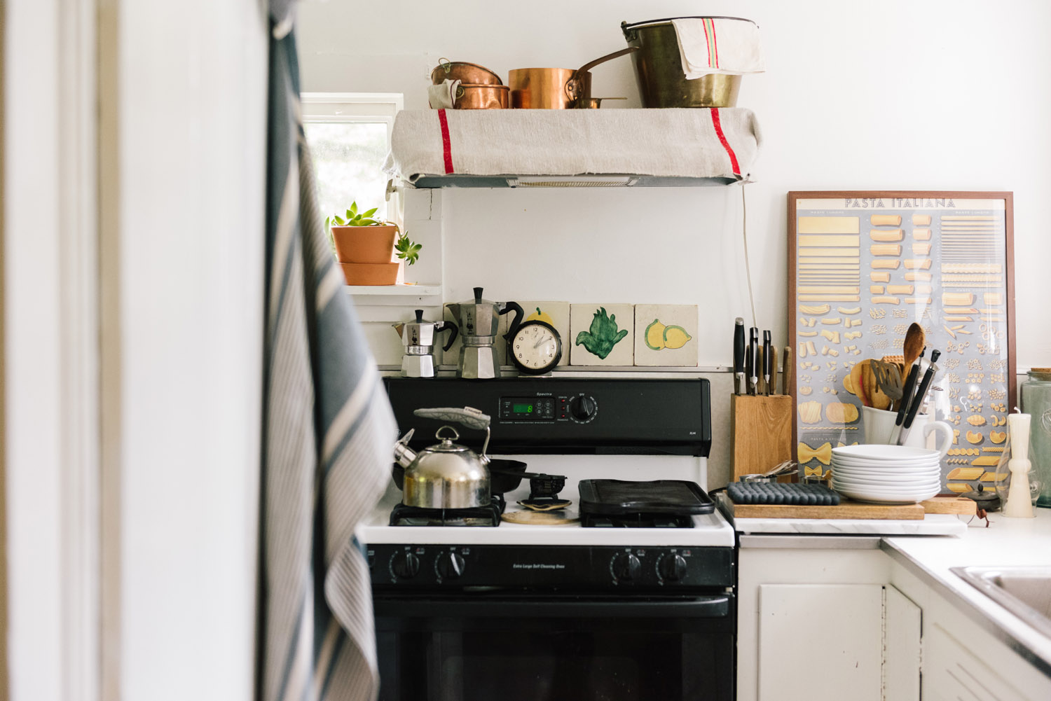
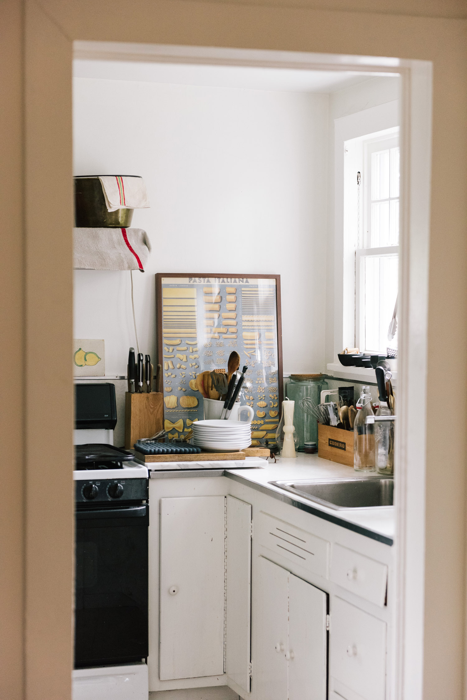
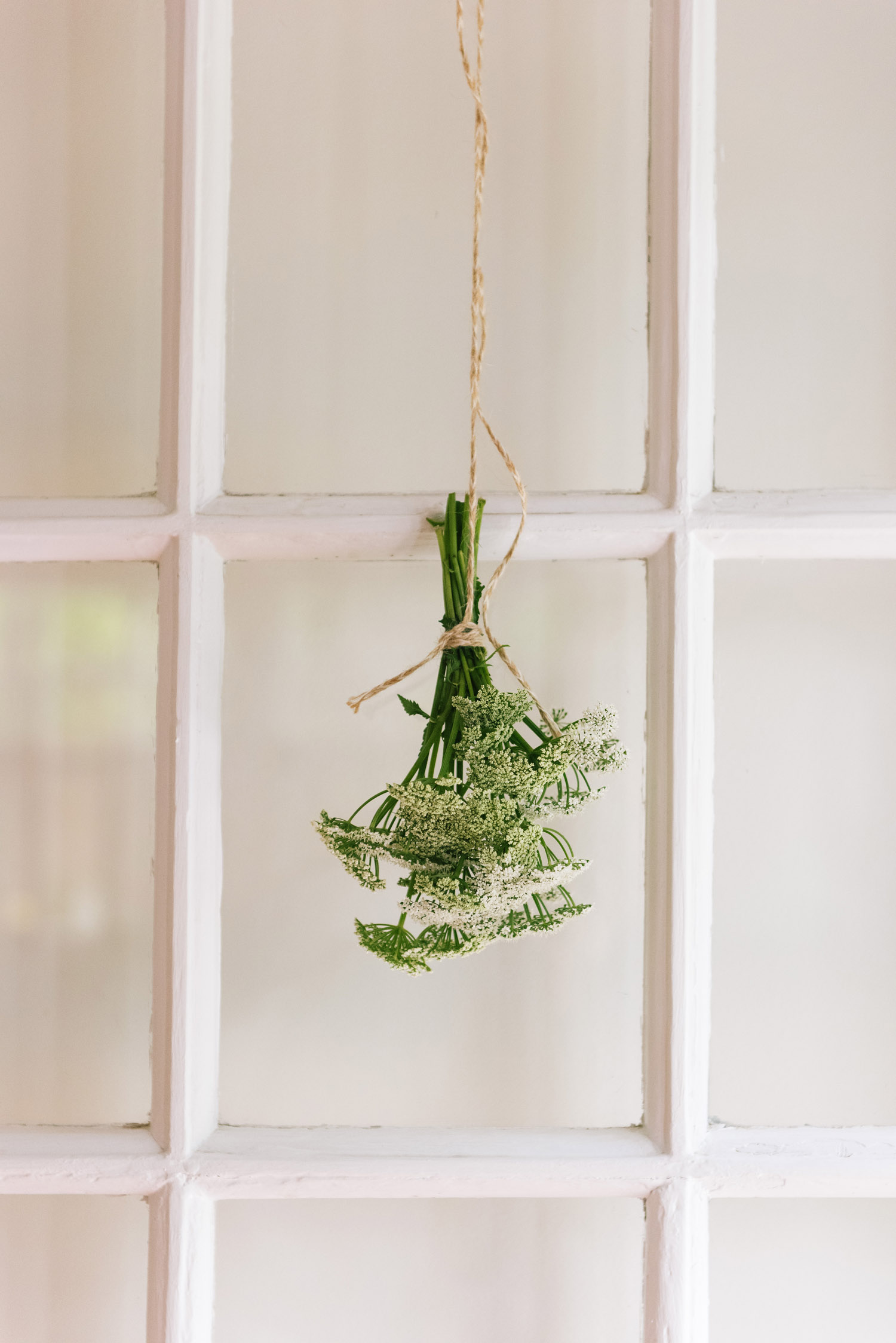
Located on the riverfront grounds of a larger estate, the red-painted two-level barn is almost absurdly picturesque. It’s modest in size, but abundant in the sort of charms one associates with Upstate New York. One can imagine Rip Van Winkle himself living here: a dutch door and a stone wall welcome guests to the tiny house; looking through the kitchen window reveals a view reminiscent of Hudson River School paintings.
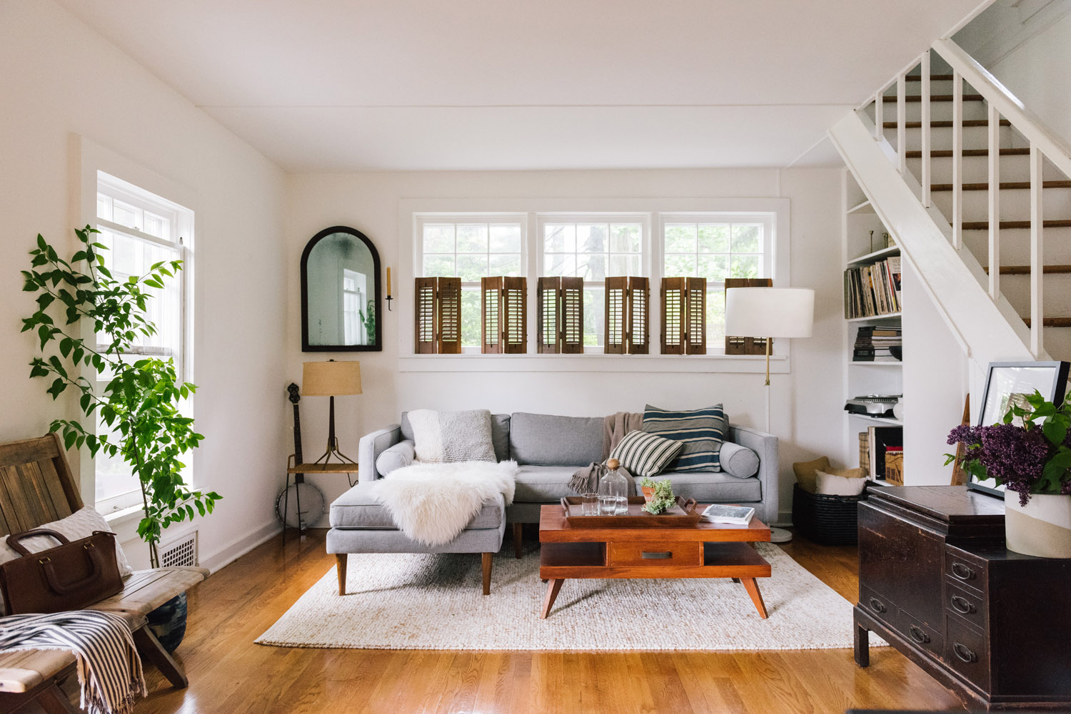
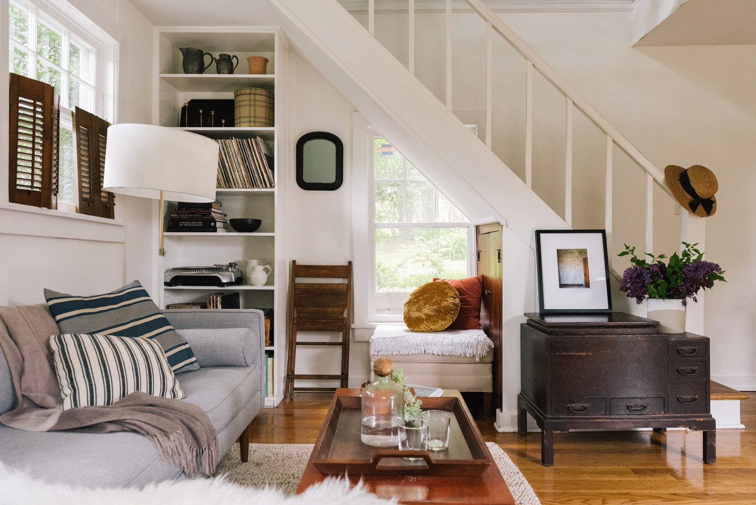
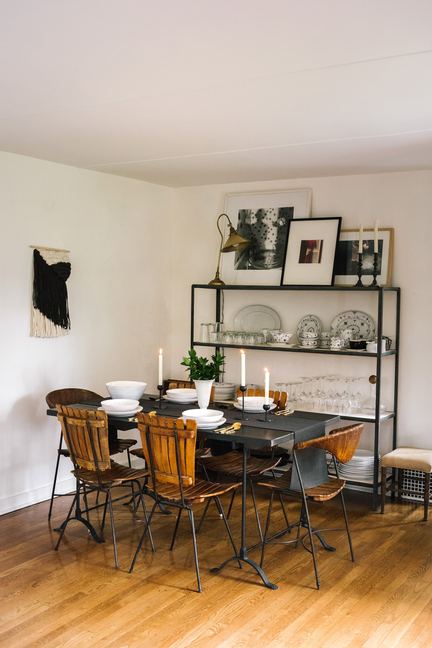
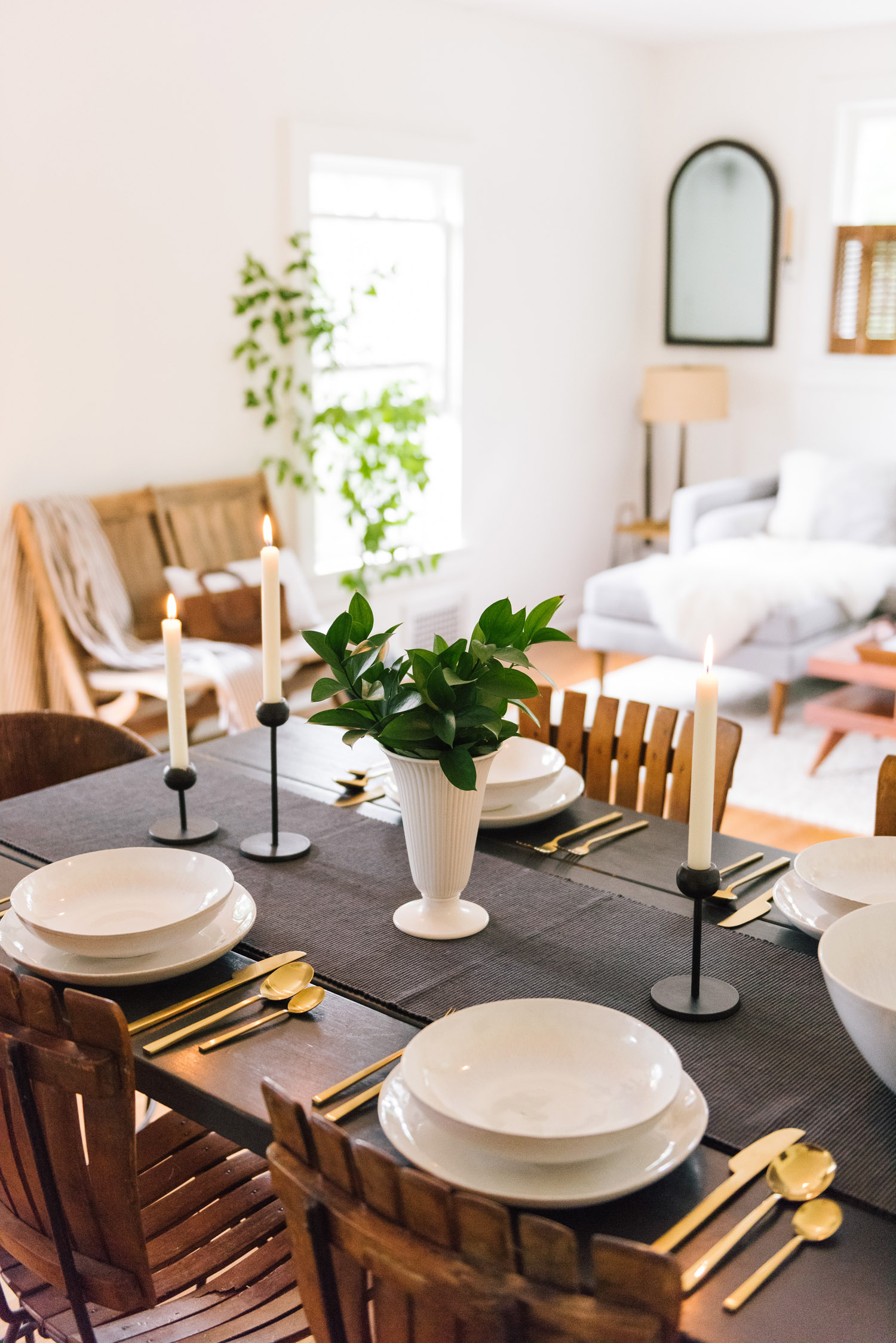
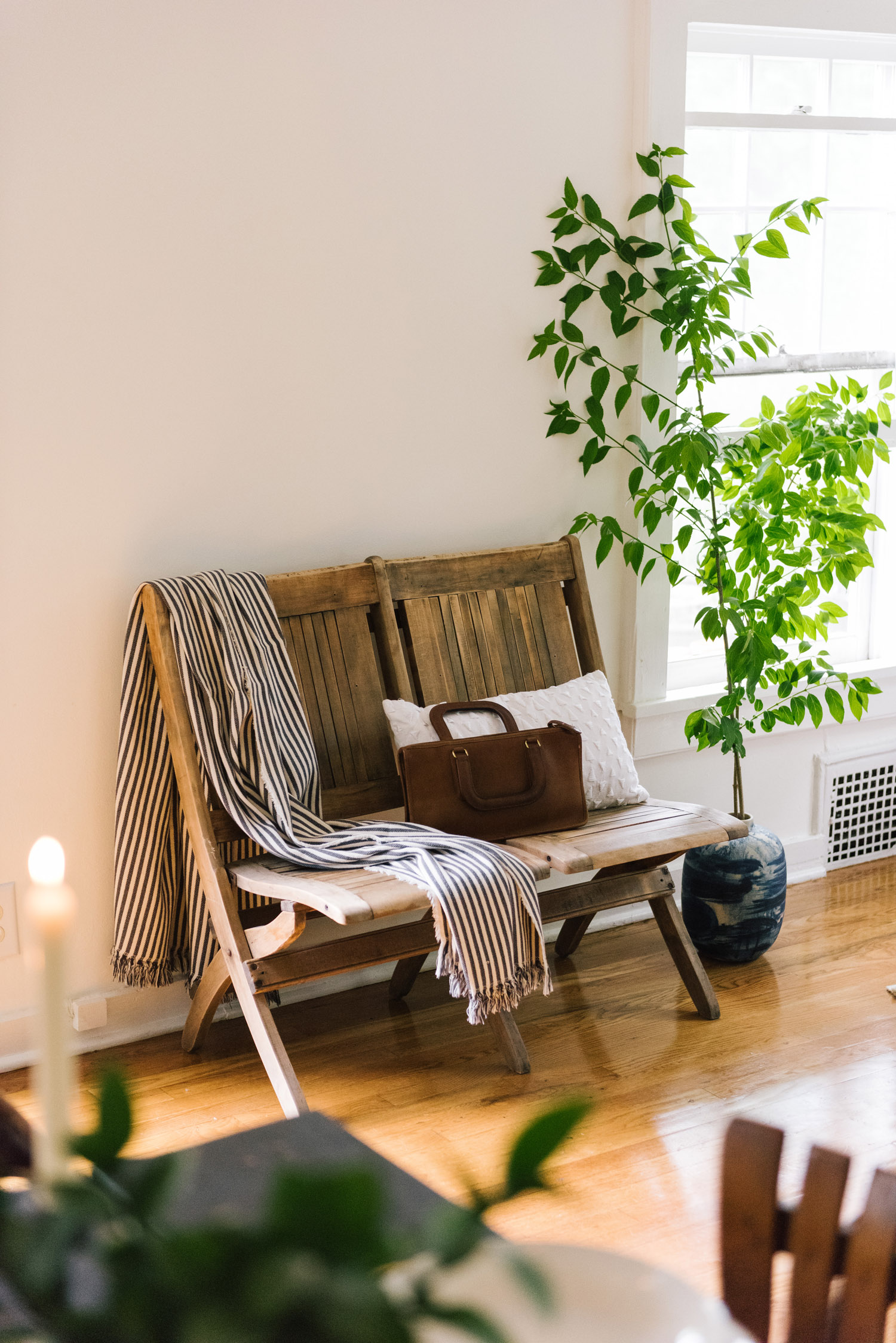
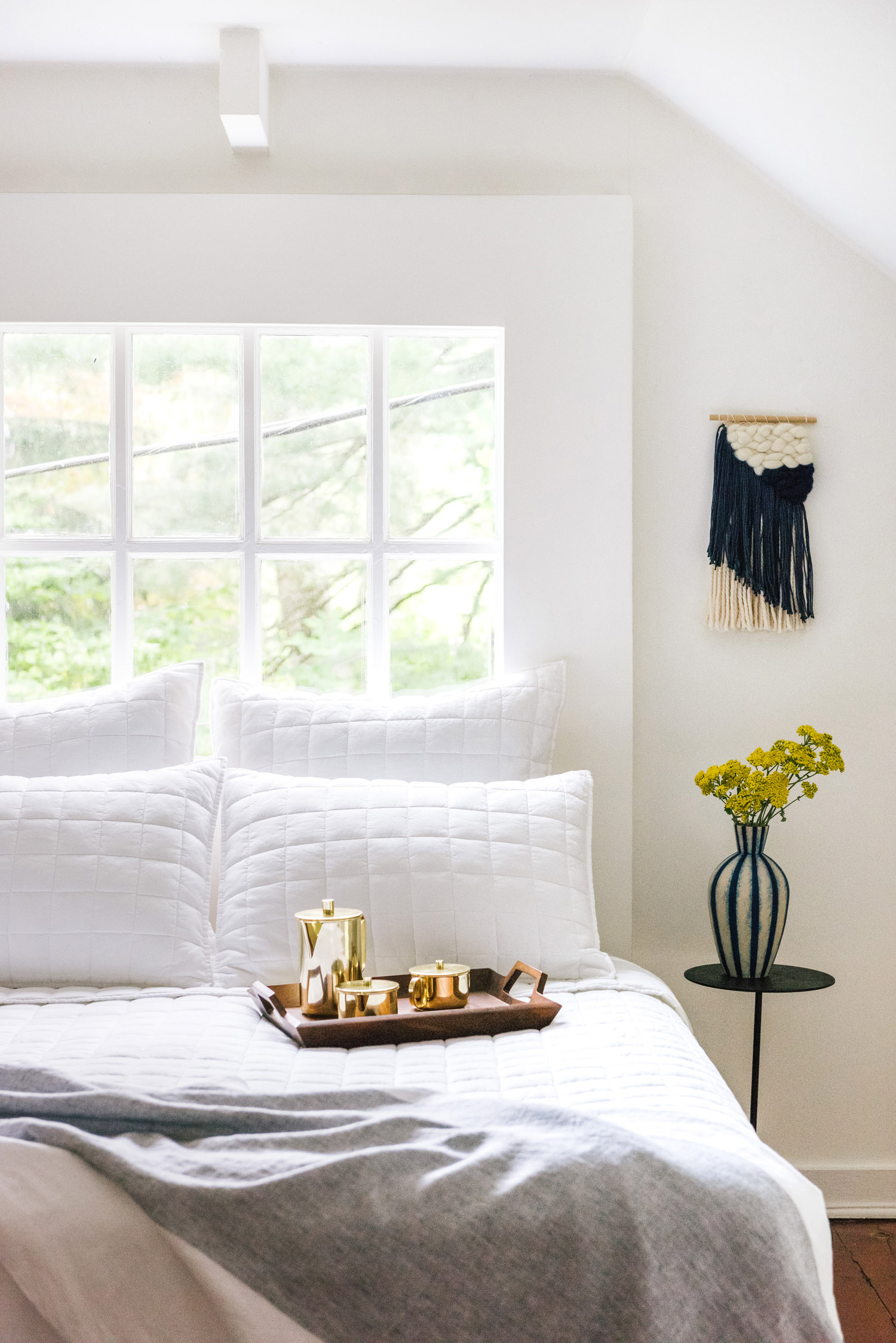
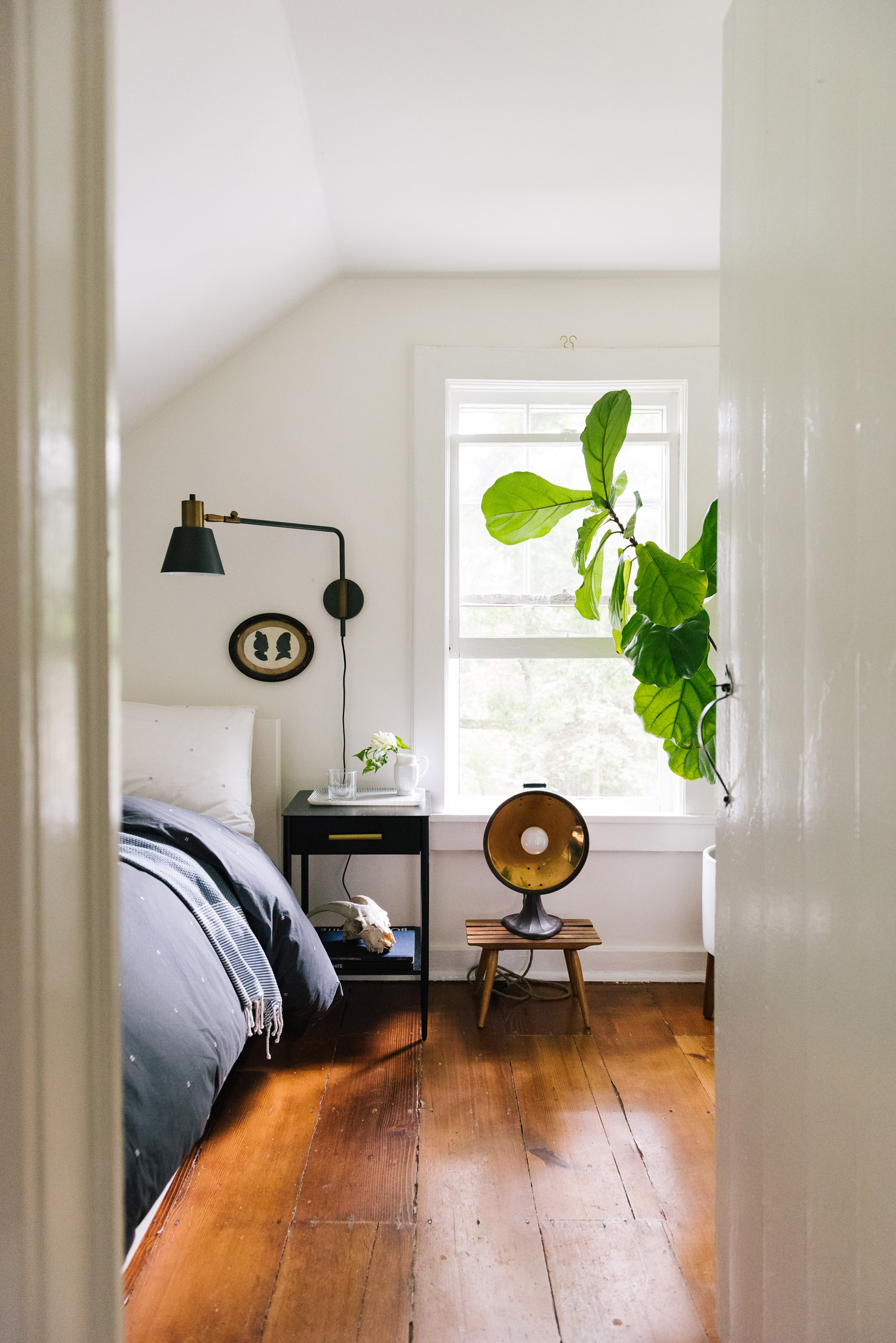
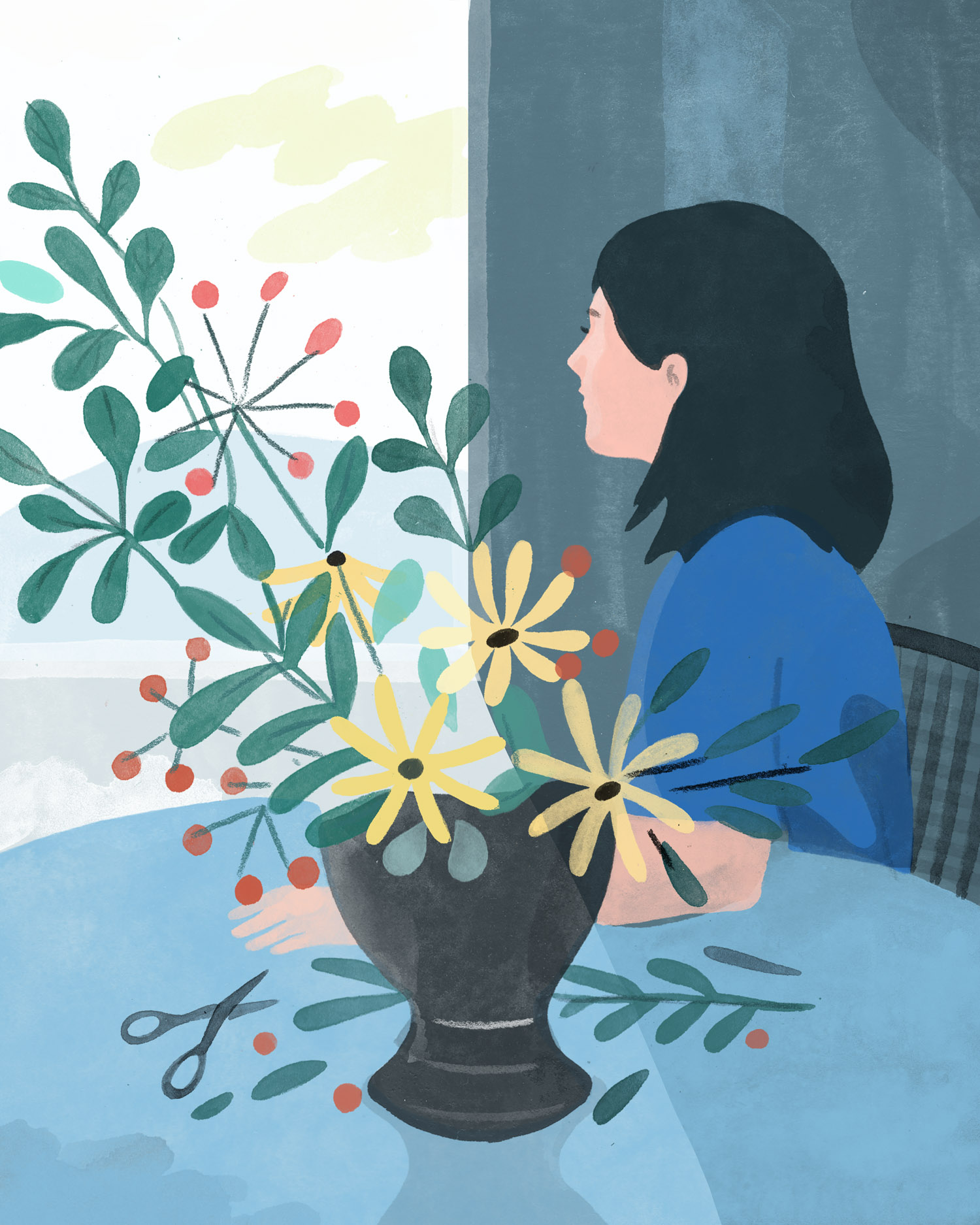
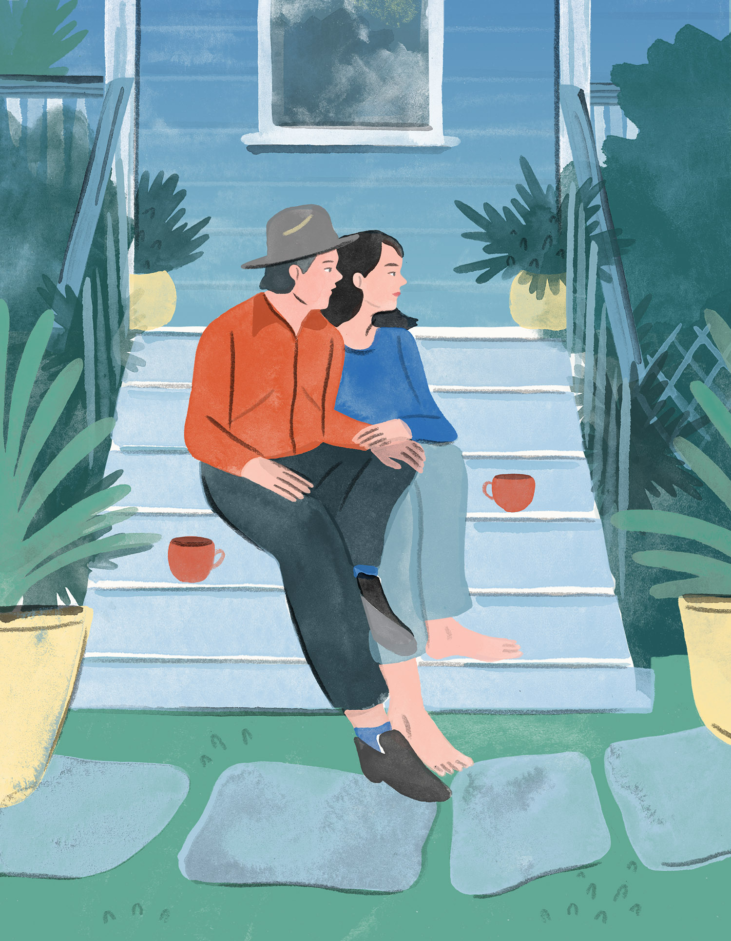
Emma and Nick have met the beauty of their new surroundings with a keen set of design eyes to match. Inspired by the timeless style of Emma’s grandmother, the couple has lovingly and judiciously appointed their space with beautiful objects, both functional and decorative. The home they have crafted is one that functions as a retreat—perfect for both quiet contemplation and entertaining. “Nick and I talk about our love for our home daily,” Emma says. “We feel constantly lucky to live here and are especially inspired by the little things like a boat going by on the river, the evening light filtering through our dutch doors, or the way our family heirlooms have combined so beautifully. At night, we take in the night air on walks around the neighborhood and pinch ourselves that we get to live somewhere this beautiful.”