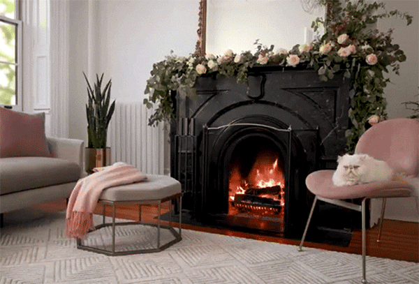
Concept, art direction, set design, and writing for the launch of a series of long-playing “fireplace” videos styled with West Elm furniture and decor. The videos were created to be played on televisions as cozy background visuals, and were accompanied by an Apple TV app that we built to stream them. This series ultimately ran multiple seasons, kicking off with the traditional holiday “yule logs,” and continuing into spring and summer with some seasonal and stylistic variations on the format, including animation.
A crackling fireplace is an obligatory fixture in any holiday fantasy, but so few of us actually have the fireplace to make such a thing happen in our own homes. Wouldn’t carving the turkey be so much better in the glow of a warm fire? Or your next cocktail party? Or opening presents on Christmas morning? If you’ve got a serious case of Fireplace FOMO, we hear you. And we came up with a solution. Enter Fireplace by west elm, our Apple TV App and YouTube Playlist that features 20+ cracking fireplaces, free to stream into your living room from your TV! It’s not a real yule log, but it’s the next best thing.
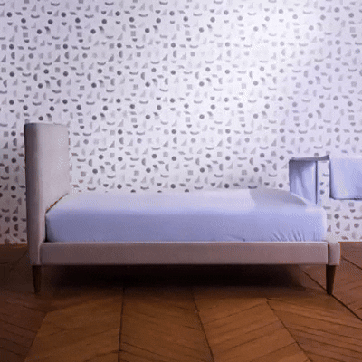
Concept, art direction, video editing, title design, and writing for West Elm’s social channels. This shoot was part of an extended series on West Elm’s Instagram and blog called “#AskWestElm,” which shared helpful tips and how-tos for the home. This installment showcased the various layers that go into making a bed, with the added whimsy of some stop-motion animation.
Your bed won’t make itself! Here are all of the layers for making a perfect bed: ✨ 1. Flat sheet – Adds a thin layer between you and your duvet. Keeps you from needing to launder your duvet cover as frequently + functions as a lightweight cover on hot summer nights. ✨ 2. Duvet/Comforter – Filled with down or down alternative, this fluffy number will keep you cozy + warm on cold nights, and adds comforting weight. ✨ 3. Coverlet/Blanket – Kept at the foot of your bed, a coverlet is great as a middle-weight cover for adding a tiny bit of extra warmth when you need it. ✨ 4. Pillows! Pillows come in a variety of shapes, sizes, and fills. Explore your options on westelm.com to see what’s best for you!
The Kingston, New York studio of Blackcreek Mercantile. Written and photographed for Design*Sponge.
Studio Tour: Blackcreek Mercantile
On a drizzly November morning last week, I found myself standing in the Kingston, NY studio of Joshua Vogel, learning way more about bees than I ever thought humanly possible. Joshua, a wildly talented woodworker—and apparently quite the loquacious fellow—has just finished telling me about propolis, the bee-produced material that is a key ingredient in his company Blackcreek Mercantile’s cutting board oil. Did you know that this wondrous, naturally anti-bacterial varnish is the only thing aside from honey and wax that honeybees produce? Did you know that, in the winter, bees will form a massive huddle and vibrate in unison to keep warm? I certainly didn’t. Although I’m meant to be snapping photographs of the space, I can’t help but feel momentarily transfixed. Joshua’s passion for everything he does is quite clear—and it’s infectious.
It’s this passion that led Vogel to create his two businesses—Blackcreek Mercantile and his fine art branch, Joshua Vogel. It’s also what led him to pen a do-it-yourself handbook on the art and history of hand-carved spoons, due out next fall from Chronicle Books. At his Midtown Kingston studio, housed in a former pajama factory, this passion is a guiding and energizing force. With a rambunctious and gung-ho team that includes woodworker Dan Votke, apprentice Max Friedman, and Josh’s partner, Kelly Zaneto, the atmosphere here is one of warmth, vitality, and conviviality. When I arrive, music is playing, coffee is brewing, wood is being turned, and Josh and Kelly’s daughter, Violet, is playing merrily in the office with studio assistant Rachel Silverbloom. If it was cold and dreary outside, one would never know.
This is to say nothing of Joshua’s actual work which is, simply put, absolutely stunning. Wonderful examples of lovingly handcrafted woodwork, Josh’s sculptures and design objects are beautiful both to look at and to hold. From elegantly carved spoons to luxurious black cutting boards, the boundary between art and functionality is practically non-existent. These are the sort of objects that one will want to use and display.
With the holidays just around the corner, Josh’s studio is producing at full-force, so we are thrilled that we were able to sneak in for a behind-the-scenes peek. We hope you enjoy the visit as much as we did!
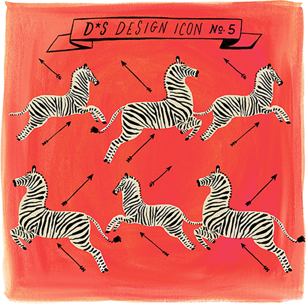
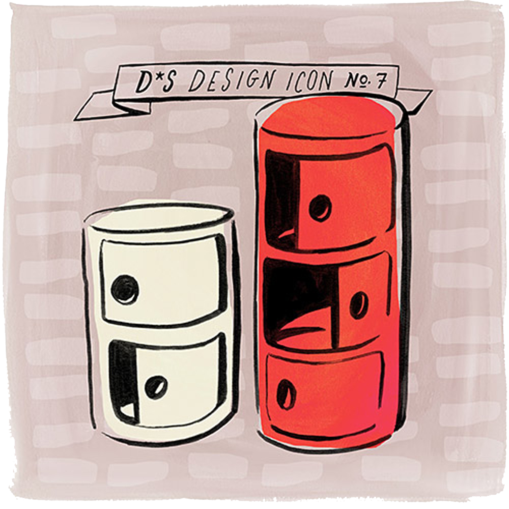
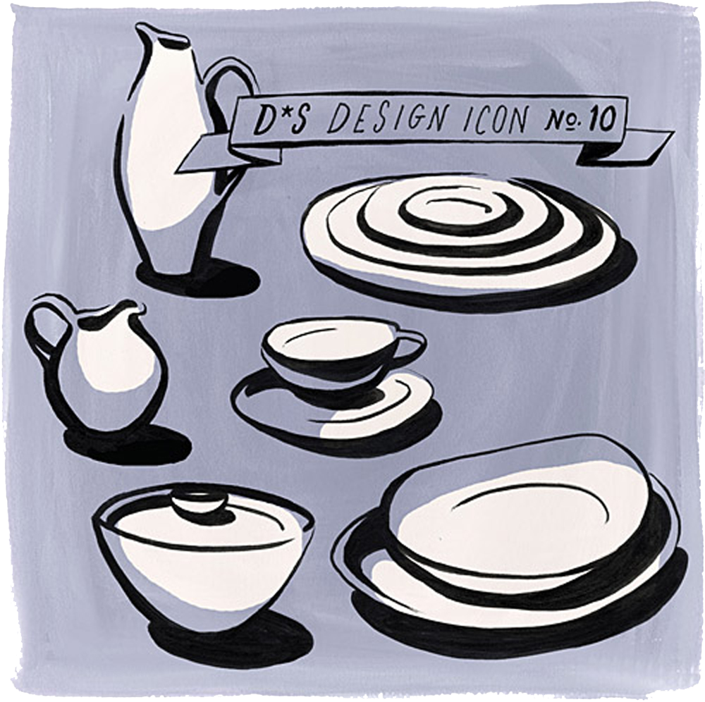
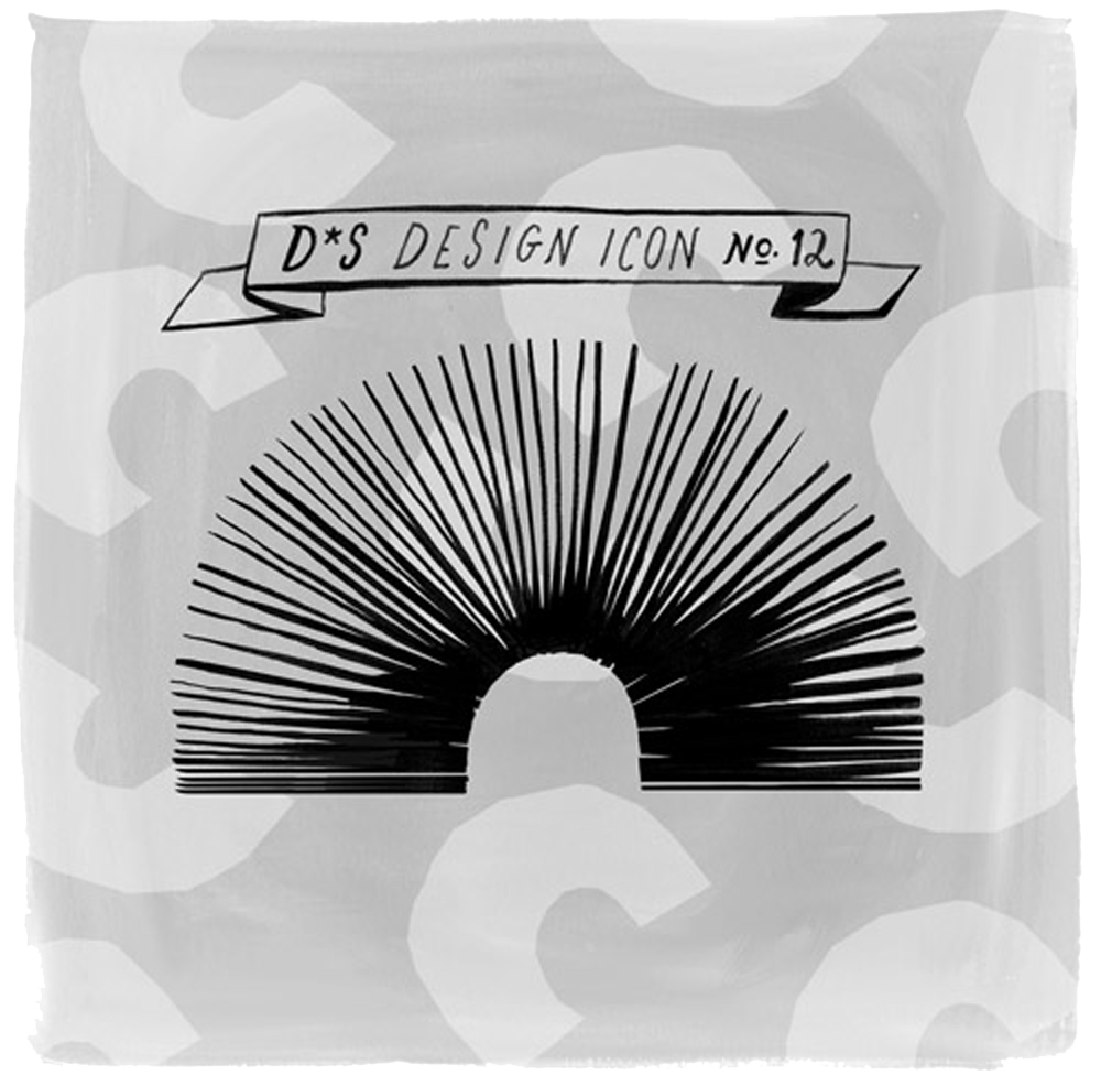
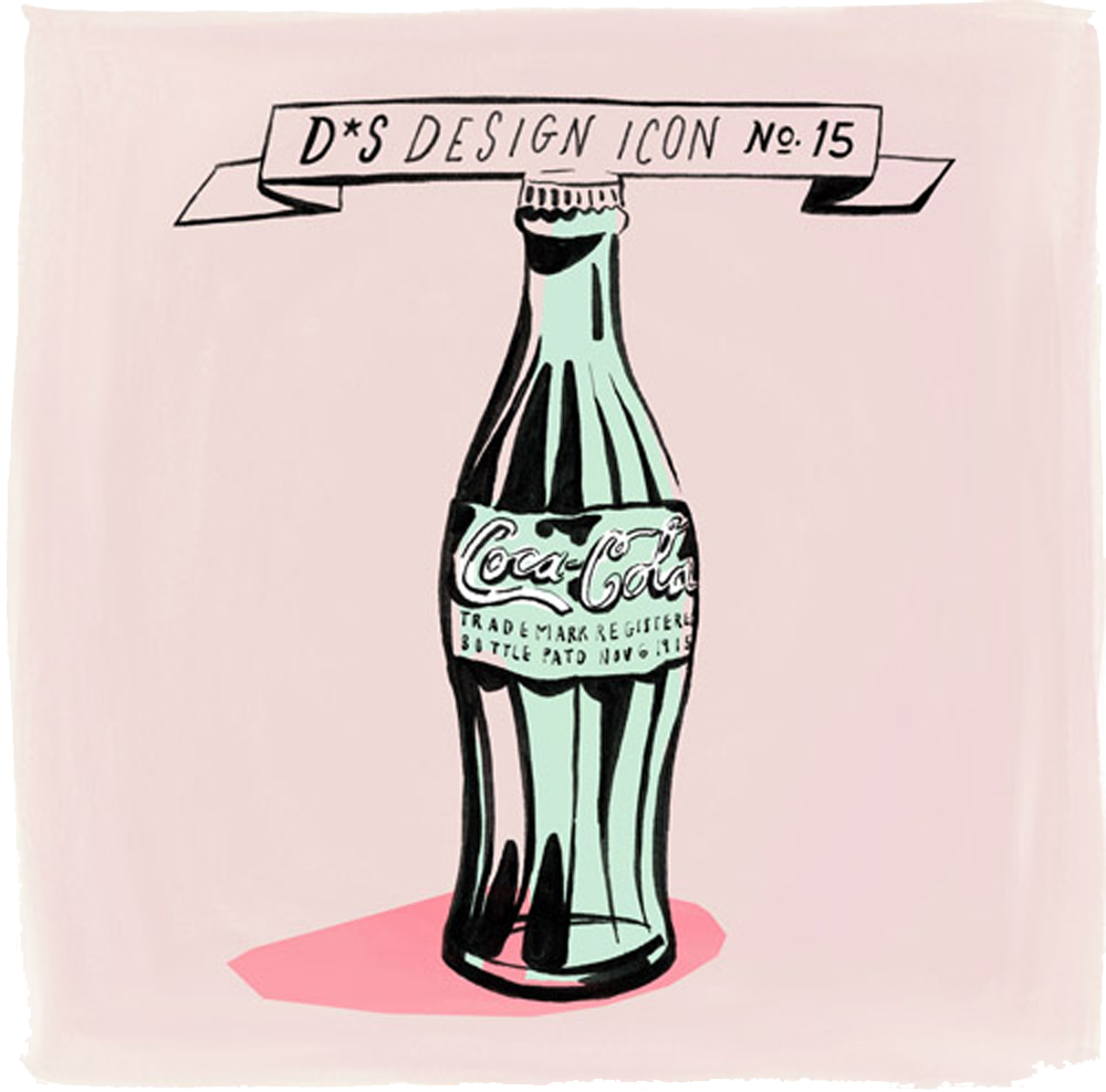
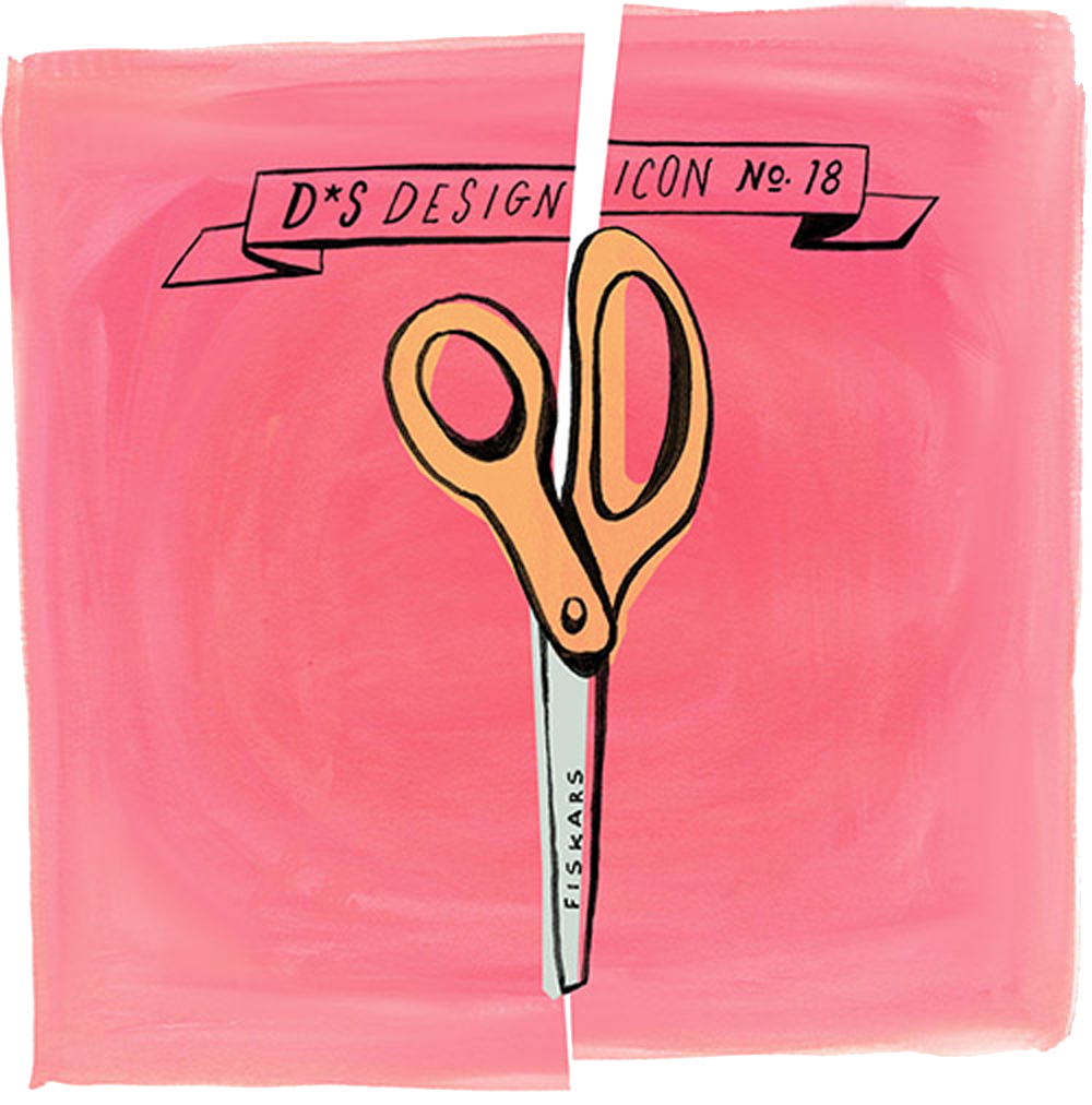
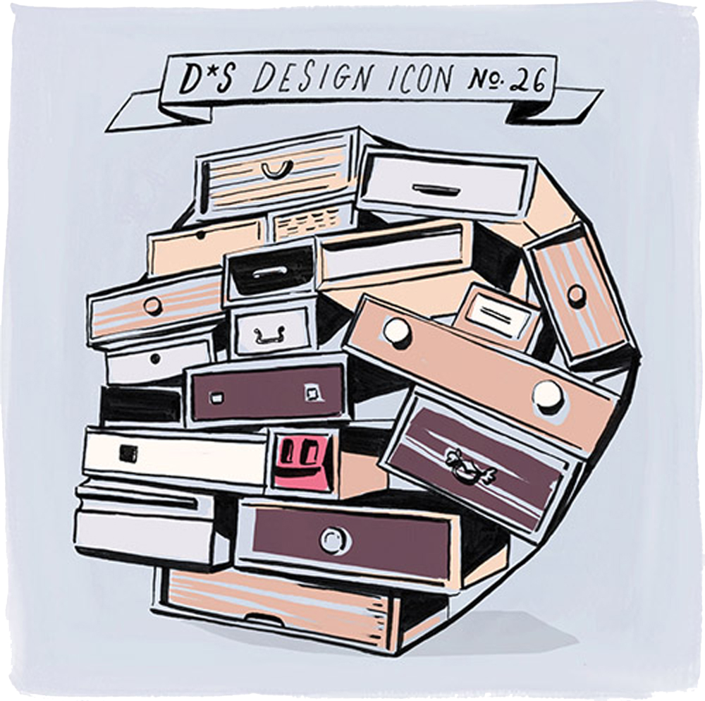
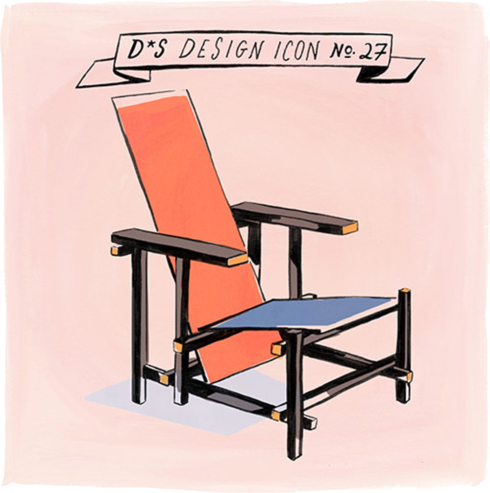
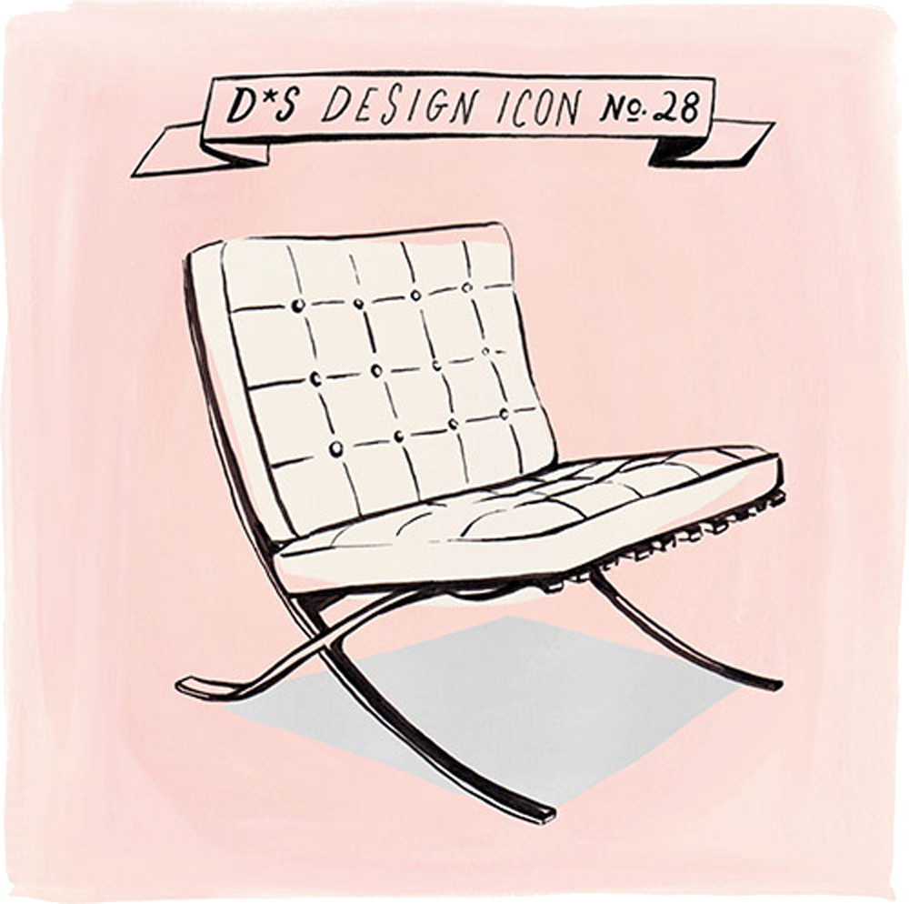
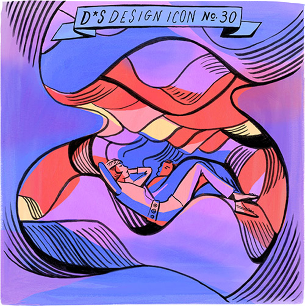
Concept, art direction, research, and writing for a weekly feature on Design*Sponge that showcased iconic design objects throughout history. The feature ran for more than 40 installments and highlighted objects like furniture, textiles, toys, and everyday objects. Each installment was accompanied by illustrations by Libby VanderPloeg.
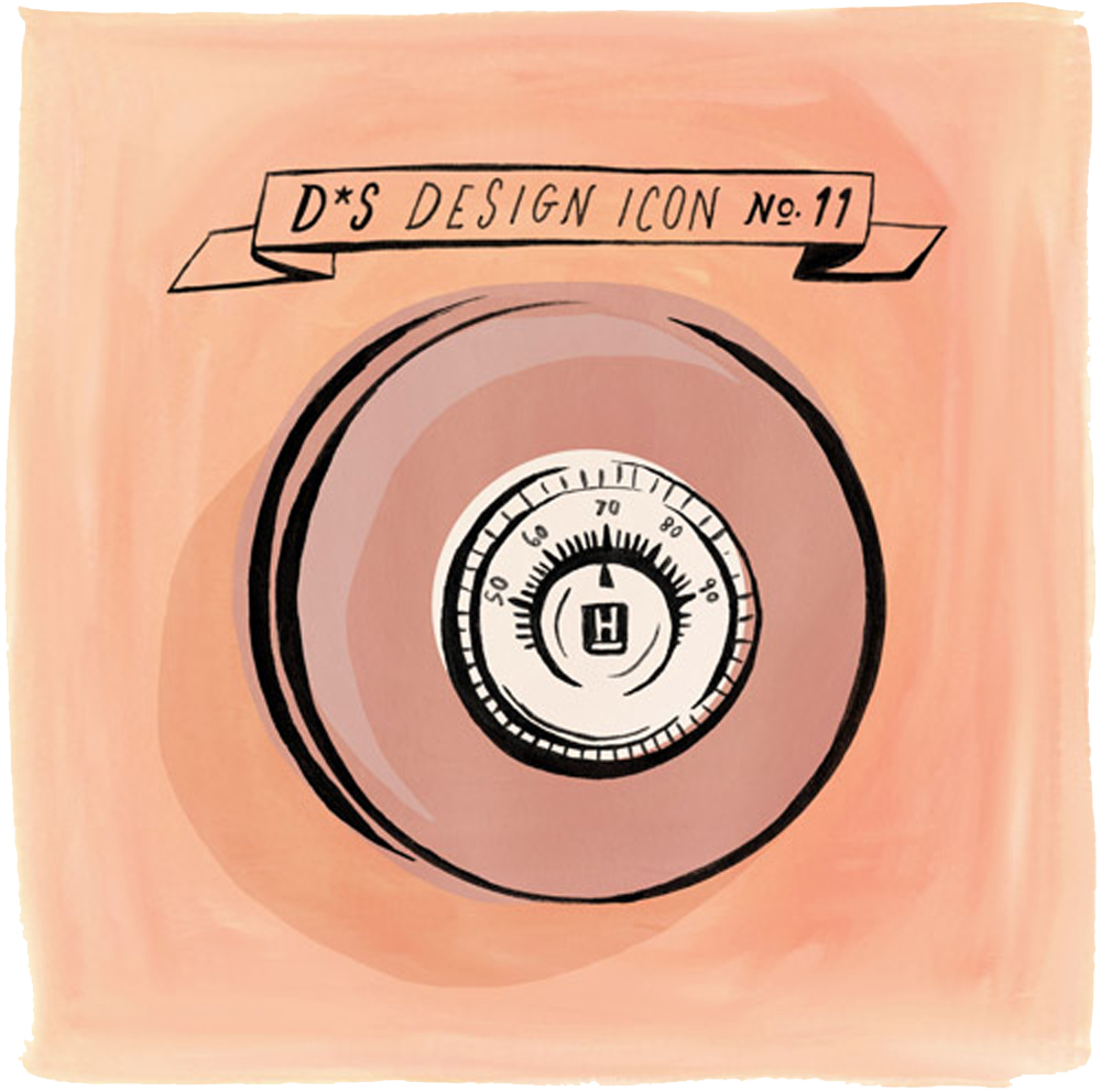
Design Icon No. 11: Honeywell Round Thermostat
Designer: Henry Dreyfuss (1904-1972)
Date: 1953
Country of Origin: United States
Manufacturer: Honeywell
Background: Although Henry Dreyfuss is often compared to his contemporary Raymond Loewy, the famed industrial designer who helped to popularize the 1930s “streamlined” look, Dreyfuss’ work stands apart because of his emphasis not on style but on function. Obsessed with ergonomics and the need for design to suit the human body, Dreyfuss compiled exhaustive data on body measurements and forms in an effort to create the most optimal designs. This information was later compiled into two books— Designing for People(1955) and The Measure of Man(1960). Several of Dreyfuss’ designs have gone on to achieve legendary status (his Bell telephone, for instance), but one of his most ubiquitous designs is without a doubt the Honeywell “Round” thermostat. Designed so that it could hang “squarely” on a wall no matter how or where it was installed, the thermostat never appeared slanted due to its circular shape. The round dial provided a simple and intuitive interface, free from cluttered buttons and unnecessary information. As design lore has it, Dreyfuss had a penchant for drawing perfect circles, something he did continuously. When approached by Honeywell to produce a new, modernized thermostat, Dreyfuss is said to have drawn a circle and said “Here. Go ahead and make something of it.”
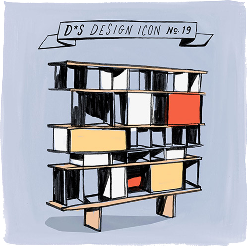
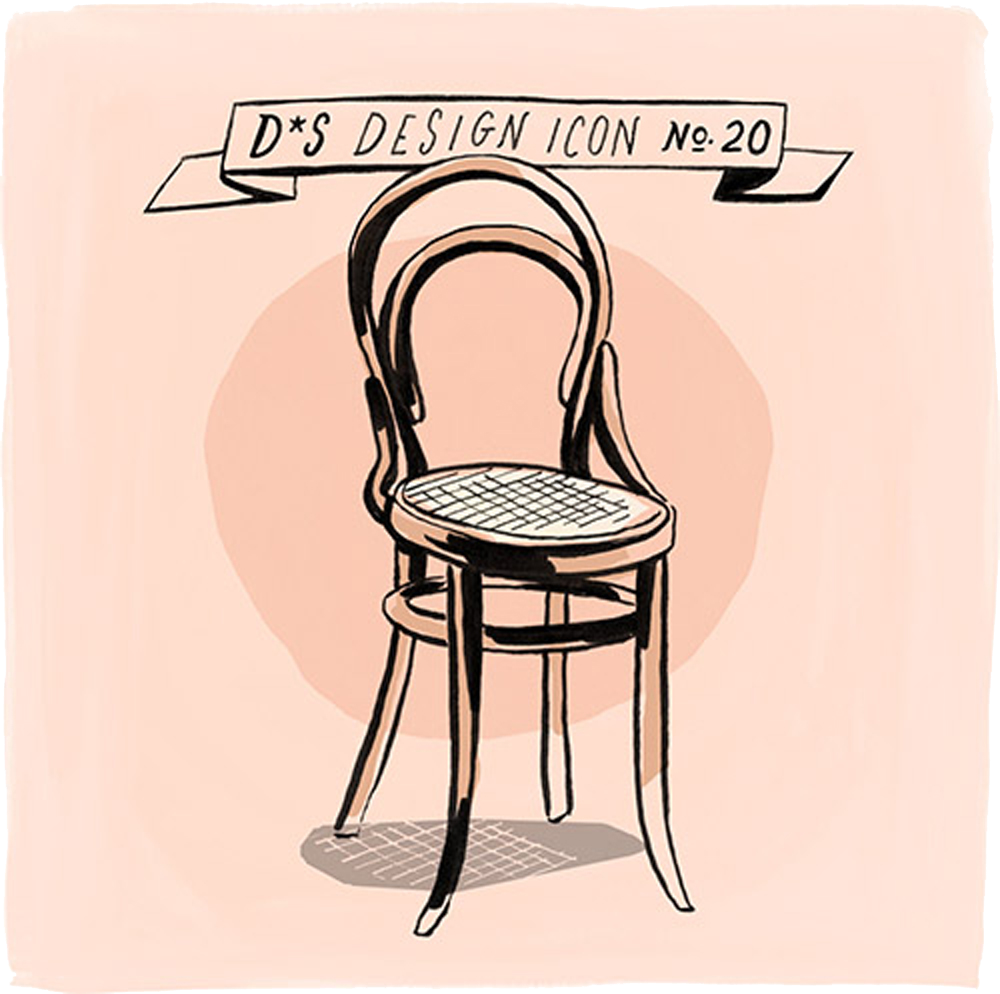
Design Icon No. 19: Bookshelf
Designer: Charlotte Perriand (French, 1903-1999), with Atelier Prouvé
Date: 1953
Country of Origin: France
Manufacturer: Atelier Prouvé (today Perriand shelves are manufactured by Cassina)
Materials and Construction: Oak shelves, aluminum vertical dividers, sliding trays to cover certain areas.
Background: As was the case with Ray Eames, female contributors to design teams were oftentimes overshadowed by their male counterparts during the twentieth century, only to be truly acknowledged in recent years. This was certainly the case for Charlotte Perriand, the designer behind some of the last century’s most iconic pieces of furniture. The above piece, oftentimes referred to as “The Mexican Bookshelf” because it was designed for the Maison du Mexique at Cité Internationale Universitaire de Paris, was commonly attributed to the french designer Jean Prouvé. In reality, the piece was designed by Charlotte Perriand and produced by Prouvé’s Atelier Prouvé. Because Jean Prouvé’s name attracted higher bids at auction, Perriand’s name was all but erased from these designs—it wasn’t until recently that the actuality of Perriand’s authorship was finally accepted and widely acknowledged. This shelf, one of several similar shelves and multi-purpose furniture pieces by Perriand, is composed of oak shelves, subdivided by aluminum vertical elements. Sliding trays ran along the front faces of the shelves, allowing users to hide and reveal certain areas. Because of the shelf’s variously-sized compartments, one was able to store a number of different objects on it. Today, many of Perriand’s shelf designs are in production again, this time by the Italian furniture company, Cassina.
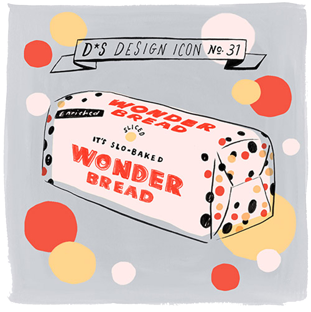
Design Icon No. 31: Wonder Bread
Date: 1921
Country of Origin: United States
Manufacturer: Taggart Baking Company
Background: You know the phrase “the best thing since sliced bread?” Well, as it so happens, the exact date of this world-changing invention is in relatively recent history. Introduced by Wonder Bread in 1929, the concept of pre-sliced bread encapsulated many of the ideals of the time. The late 20s and early 30s saw the introduction of Modernism to America, largely through the over-the-top ornamentalism of the Art Deco and Moderne movements—it wasn’t so much about functionality, but the novel and the superficially futuristic. Scientific and industrial advances had captured the nation’s imagination, something that created a thirst for products that embodied these ideas—even if that product was bread, pre-sliced. Since then, Wonder Bread has become part of the the American canon, the embodiment of the American impulse for wild innovation and an icon of our Atomic Age. In 1939, Wonder Bread took part in New York City’s World’s Fair, an event that showcased similarly futuristic productions, from advances in agricultural technology to the latest and greatest in automobiles. Although it may not seem this way today—indeed, we have long-since abandoned the fluffy white goodness of Wonder Bread for healthier options—Wonder Bread (and its mythology) fit in perfectly.