Art direction, video editing, and title design for West Elm.
Videography by Zack Taylor. Styling by Marie Sullivan.

Art direction, video editing, and title design for West Elm.
Videography by Zack Taylor. Styling by Marie Sullivan.

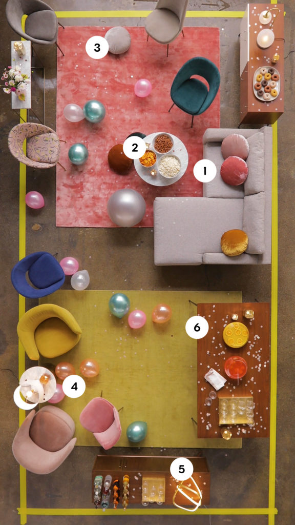
Concept, art direction, set design, video editing, and title design for West Elm.
Videography by Zack Taylor. Styling by Elvis Manard.
Originally published on the West Elm blog as “How To Get Your Apartment Party-Ready“
How To Get Your Apartment Party-Ready
There are certain things that are no-brainers when it comes to throwing a party. Food, drinks, music—check, check, check. But there are some other details that can make all the difference between a snooze-fest and an all-nighter (in a good way).
Have you ever noticed how guests always corral in the kitchen during parties, only to leave your living room a ghost town? Do you find that people hover for too long near the canapés and cocktails without circulating? The problem could be traffic flow. While your furniture arrangement might work for day-to-day use, a dining table or an inconvenient sectional chaise can cramp things up when things get crowded, forcing people into bottle-necks. Avoid the holiday traffic jam this year and follow these tips for maximizing your cocktail party floor plan.
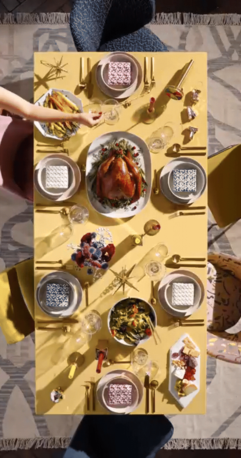
Concept, art direction, video editing, title design, and writing for West Elm
Videography by Zack Taylor. Styling by Marie Sullivan. Food Styling by Jason Schreiber.
How To Set Your Table For The Holidays
If you’re miserable at chopping vegetables and a roasting turkey is best left in somebody else’s care, chances are you’re the type of person who gets tasked with setting the table at holiday dinners. Although this not-quite-thrilling duty is simple (does it really matter where the salad fork goes?), it does present the culinarily challenged a rare opportunity to show off. Follow the simple tips in this video and you’ll earn extra points with your host and compliments from other dinner guests. “What a lovely table setting! Who did that?” YOU DID.

Concepted, written, and photographed as a parody feature for West Elm’s blog, Front + Main. Timed to go live during Fall Fashion Week, the story played with the idea of a trend piece that showcased how people might wear their duvet around their house.
—
How To Wear A Duvet
Forget sock boots and metallics—the hottest Fall fashion trend that we can’t get enough of is duvets. With a name derived from the French term for down—an allusion to the feathery material that typically fills them—duvets are customarily seen atop lavishly appointed beds and covered in all manner of beautiful fabrics. This season, they’ve come into vogue as a stylish garment—one that can be donned for practically any occasion. Need something to wear for gala season? Duvet. Going out for a quick lunch with the ladies? Duvet. Heading to an important business meeting? Yes way, duvet! While there are myriad ways to style this new wardrobe essential, here are 10 of our favorites.

Created to promote West Elm’s new collections of dinnerware.
Concept, art direction, set design, video editing, and title design for West Elm.
Videography by Zack Taylor. Styling by Marie Sullivan. Food Styling by Jason Schreiber.
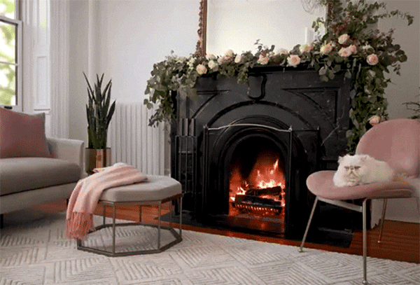
Concept, art direction, set design, and writing for the launch of a series of long-playing “fireplace” videos styled with West Elm furniture and decor. The videos were created to be played on televisions as cozy background visuals, and were accompanied by an Apple TV app that we built to stream them. This series ultimately ran multiple seasons, kicking off with the traditional holiday “yule logs,” and continuing into spring and summer with some seasonal and stylistic variations on the format.
Videography by Zack Taylor.
Styling by Marie Sullivan.
Stream These Stylish Yule Logs Right To Your TV
A crackling fireplace is an obligatory fixture in any holiday fantasy, but so few of us actually have the fireplace to make such a thing happen in our own homes. Wouldn’t carving the turkey be so much better in the glow of a warm fire? Or your next cocktail party? Or opening presents on Christmas morning? If you’ve got a serious case of Fireplace FOMO, we hear you. And we came up with a solution. Enter Fireplace by west elm, our Apple TV App and YouTube Playlist that features 20+ cracking fireplaces, free to stream into your living room from your TV! It’s not a real yule log, but it’s the next best thing

Concept, art direction, video editing, title design, and writing for West Elm’s social channels. This shoot was part of an extended series on West Elm’s Instagram and blog called “#AskWestElm,” which shared helpful tips and how-tos for the home. This installment showcased the various layers that go into making a bed, with the added whimsy of some stop-motion animation.
Videography by Zack Taylor.
Soft Styling by Eduardo Vinueza.
INSTAGRAM CAPTION:
Your bed won’t make itself! ? Here are all of the layers for making a perfect bed:
✨
1. Flat sheet – Adds a thin layer between you and your duvet. Keeps you from needing to launder your duvet cover as frequently + functions as a lightweight cover on hot summer nights.
✨
2. Duvet/Comforter – Filled with down or down alternative, this fluffy number will keep you cozy + warm on cold nights, and adds comforting weight.
✨
3. Coverlet/Blanket – Kept at the foot of your bed, a coverlet is great as a middle-weight cover for adding a tiny bit of extra warmth when you need it.
✨
4. Pillows! Pillows come in a variety of shapes, sizes, and fills. Explore your options on westelm.com to see what’s best for you!

Concept and Art Direction for a series of zines about the topic of “home.” Featured as printable downloads for West Elm’s Holiday 2016 Campaign.
Illustrations provided by Tallulah Fontaine, Marcus Oakley, Maria Ines Gul, and Julia Rothman.


Writing contributions for The Cooper Hewitt Museum’s “Object of The Day” (now Object of The Week) series, which launched as a way to provide the public with in-depth access to the museum’s design collection. Each day, the museum shared one object from its collection, with imagery, accession information, and a brief backstory.
A Colorful Identity
Original posting, April 18, 2013
From the New York Subway system to American Airlines, Massimo Vignelli was responsible for some of the most iconic and enduring graphic identities of the twentieth century. Born in Milan in 1931, Vignelli displayed an interest and aptitude in design at a relatively early age. At sixteen, he began working as a draftsman at Castiglioni Architects in Milan. Here, he not only became immersed in the practice of architectural design, but also in the ideas of key Modernist thinkers.
As a designer, Vignelli firmly believed that design should be clean, simple, and completely timeless. He detested trends and what he referred to as the “culture of obsolescence.” For him, good design surpassed the merely ephemeral, something he believed was a cause of waste and “visual pollution.” He favored primary colors and simple typefaces. “I don’t believe,” he has written in The Vignelli Canon, “that when you write dog the type should bark!” While Vignelli limited himself to just a few colors and typefaces, he was able to create intriguing, eye-catching designs through his clever plays with proportion, space, and balance. Like many of his modernist peers, he was obsessed with the grid and his negotiation with its stark boundaries produced elegant and beautiful results.
In 1967, Massimo Vignelli was commissioned to redesign the graphic identity of the American furniture company, Knoll. Known for its modernist furniture by designers such as Eero Saarinen, Marcel Breuer, and Harry Bertoia, Knoll’s products were perfectly suited to Vignelli’s timeless aesthetic. In the graphic program that Vignelli produced for Knoll, one can see many of his ideas at work, from his preference for clear, organized space to his use of the new (at the time) Helvetica typeface, something Vignelli undoubtedly favored because of its versatile simplicity. This poster depicts the Knoll logotype in large letters that overlap to form an almost abstract pattern. While a number of Knoll’s products are depicted as line drawings on the back of the poster, none are visible on its recto. Alone, the colorful, bold type communicates beautifully the power and elegance of the Knoll brand.
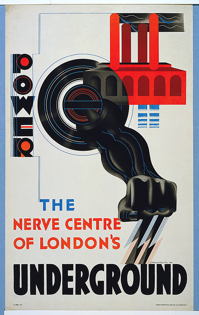
The Power Underground
Original posting: January 10, 2013
When it was introduced to London in the 19th century, the first underground railway was revolutionary. Able to provide quick, uninterrupted travel for commuters and easy access to the bustling city from the suburbs, the London Underground promised a better, more efficient future. It would take some convincing, however, to get the general public to hop onboard. People were understandably skeptical of the new technological marvel—after all, the idea of loud, smoky locomotives navigating the dark circuitry of London’s underbelly wasn’t particularly appetizing. In fact, the public was so unwilling to experience this new form of transport that the Underground Group faced bankruptcy at the beginning of the 20th century due to lack of ridership. In order to dispel any doubts about the safety and comfort of the new subway system, the general manager of the Underground, 30-year-old Frank Pick, turned to poster design to get the message across.
The first posters commissioned by Pick touted the convenience, pleasure, and affordability of traveling underground. Aesthetically, these initial posters were in line with other advertisements of the time. In addition to featuring an assortment of possible Underground passengers, these posters sought to add glamor to London Transport by illustrating the numerous scenic destinations accessible through mass transit.
As the century progressed, Pick became more adventurous in his choices for poster designers. As the public became accustomed to traveling underground, new posters were commissioned to advertise not only the Underground’s accessibility, but its modernity. This 1930 poster, Power—The Nerve Center of London’s Underground, designed by the esteemed E. McKnight Kauffer, is a one such example. Taking cues from other Modernist graphic designers, Kauffer communicates the speed and might of London’s Underground with bold, modern typefaces and dynamic illustrations.
With their stunning aesthetic qualities and avant-garde sensibilities, the Underground posters produced during the early to mid-20th century were unusual in that they blurred the line between advertising and art. In addition to graphic designers like Kauffer, Pick commissioned artists such as Man Ray, Lázsló Moholy-Nagy, and Graham Sutherland to produce posters that added beauty and prestige to the Underground brand. Pick’s preference for simple, yet aesthetically thrilling designs set a high standard for transit advertising—something that The London Underground has endeavored to continue to this day

The Kingston, New York studio of Blackcreek Mercantile. Written and photographed for Design*Sponge.


Studio Tour: Blackcreek Mercantile
On a drizzly November morning last week, I found myself standing in the Kingston, NY studio of Joshua Vogel, learning way more about bees than I ever thought humanly possible. Joshua, a wildly talented woodworker—and apparently quite the loquacious fellow—has just finished telling me about propolis, the bee-produced material that is a key ingredient in his company Blackcreek Mercantile’s cutting board oil. Did you know that this wondrous, naturally anti-bacterial varnish is the only thing aside from honey and wax that honeybees produce? Did you know that, in the winter, bees will form a massive huddle and vibrate in unison to keep warm? I certainly didn’t. Although I’m meant to be snapping photographs of the space, I can’t help but feel momentarily transfixed. Joshua’s obvious passion for everything he does is quite clear—and it’s infectious.
It’s this passion that led Vogel to create his two businesses—Blackcreek Mercantile and his fine art branch, Joshua Vogel. It’s also what led him to pen a do-it-yourself handbook on the art and history of hand-carved spoons, due out next fall from Chronicle Books. At his Midtown Kingston studio, housed in a former pajama factory, this passion is a guiding and energizing force. With a rambunctious and gung-ho team that includes woodworker Dan Votke, apprentice Max Friedman, and Josh’s partner, Kelly Zaneto, the atmosphere here is one of warmth, vitality, and conviviality. When I arrive, music is playing, coffee is brewing, wood is being turned, and Josh and Kelly’s daughter, Violet, is playing merrily in the office with studio assistant Rachel Silverbloom. If it was cold and dreary outside, one would never know.
This is to say nothing of Joshua’s actual work which is, simply put, absolutely stunning. Wonderful examples of lovingly handcrafted woodwork, Josh’s sculptures and design objects are beautiful both to look at and to hold. From elegantly carved spoons to luxurious black cutting boards, the boundary between art and functionality is practically non-existent. These are the sort of objects that one will want to use and display.
With the holidays just around the corner, Josh’s studio is producing at full-force, so we are thrilled that we were able to sneak in for a behind-the-scenes peek. We hope you enjoy the visit as much as we did!